Brand Design
The Quality Consultant
A structured visual brand identity for a consultancy that brings order to business chaos.
Project Brief
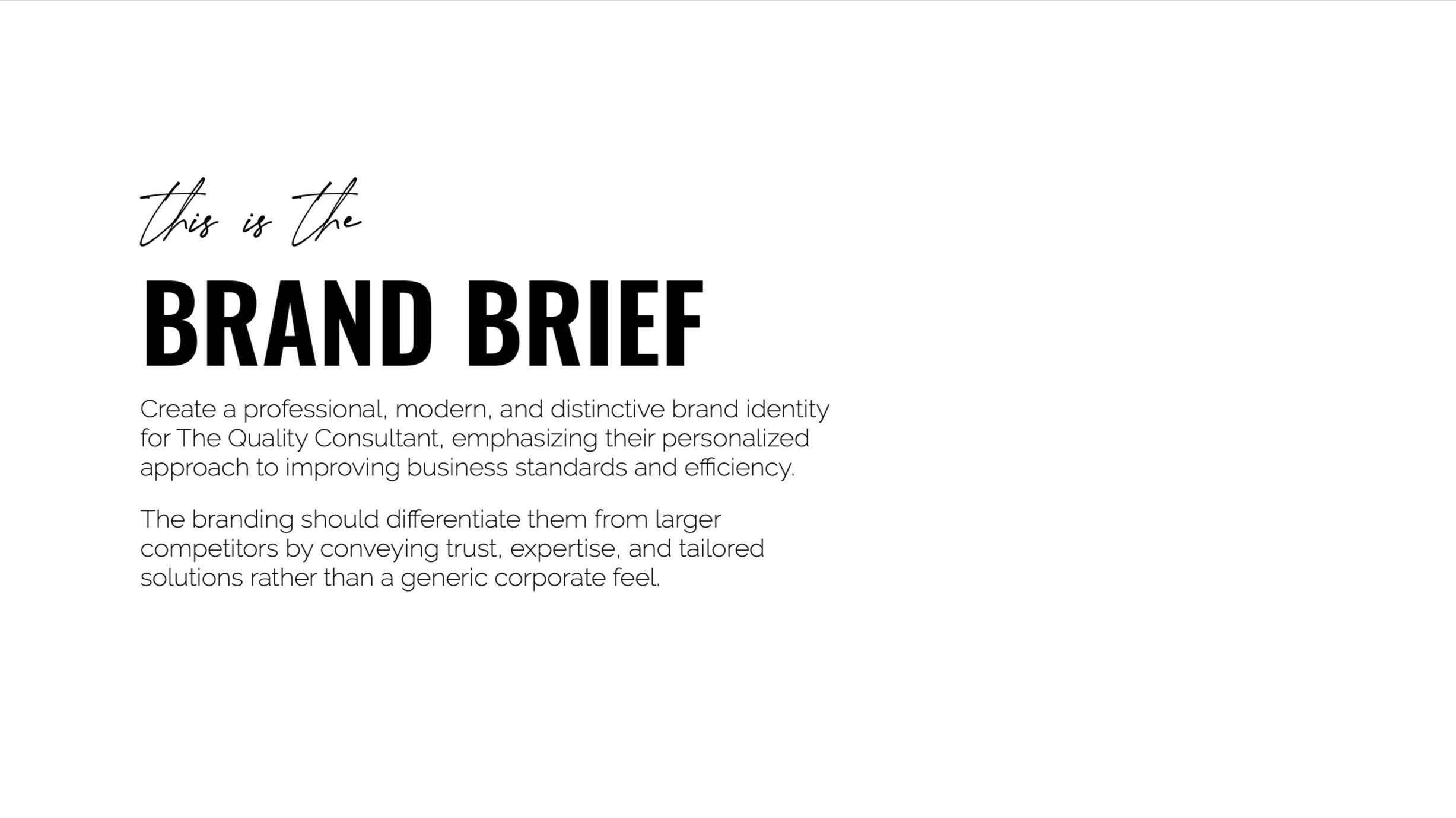
The Quality Consultant is a South African-based business that helps clients improve operational standards and efficiency. Their work often overlaps with ISO certification but is not limited to it. They offer deeply personalized, hands-on service—a key differentiator in an industry filled with faceless corporates.
My task was to design a professional and distinctive brand identity that communicates trust, expertise, and tailored solutions. Deliverables included a new logo, color palette, typography system, business cards, email signatures, custom icons, and a comprehensive brand guide.
The process
Logo Concepts
During the kickoff call, we discussed the importance of professionalism, clarity, and warmth. We also looked at other players in the industry. I developed three logo concepts based on the conversation.
1
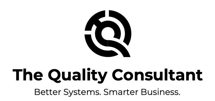
Concept 1: The Bold One
A circular icon built from the shapes of the letters T, Q, and C. The design echoed gears or an engine part—symbolizing smooth operations and interlocking systems.
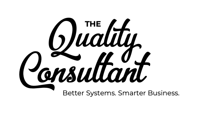
Concept 2: The Friendly One
A font-focused, slightly vintage design that emphasized honesty and relationship-driven service. It set the brand apart from clinical or overly modern competitors.
Concept 3: The Sophisticated One
A minimal mark combining a lowercase q and c in a figure-eight motif, suggesting infinity, continuity, and integration.
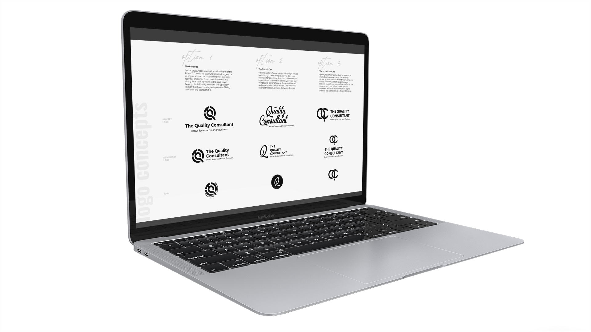
To maintain focus on the structure, all concepts were presented in black and white. This removed color bias and ensured the logo would work in all contexts.
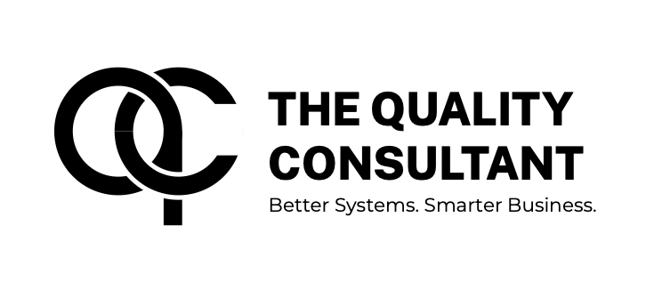
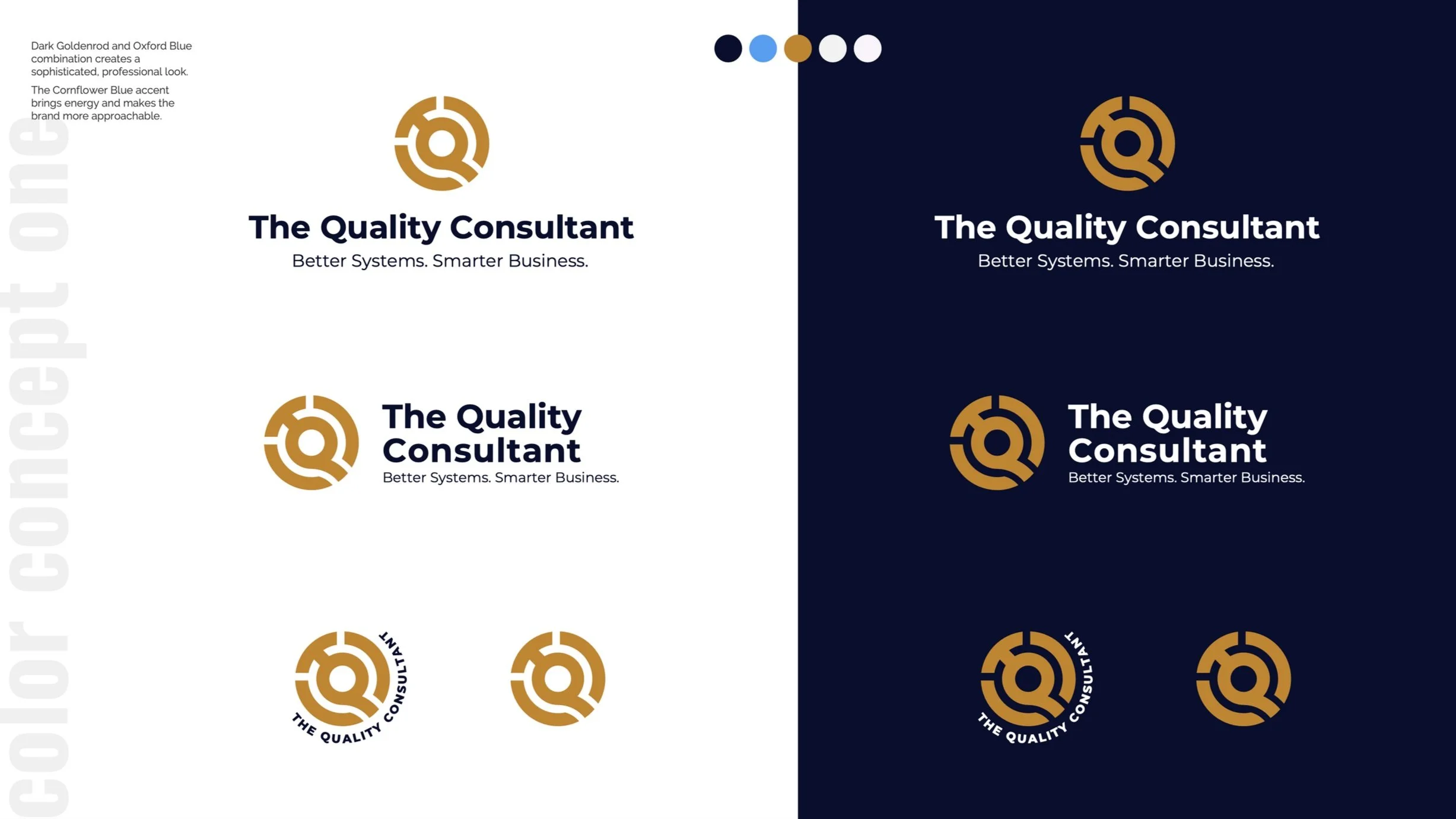
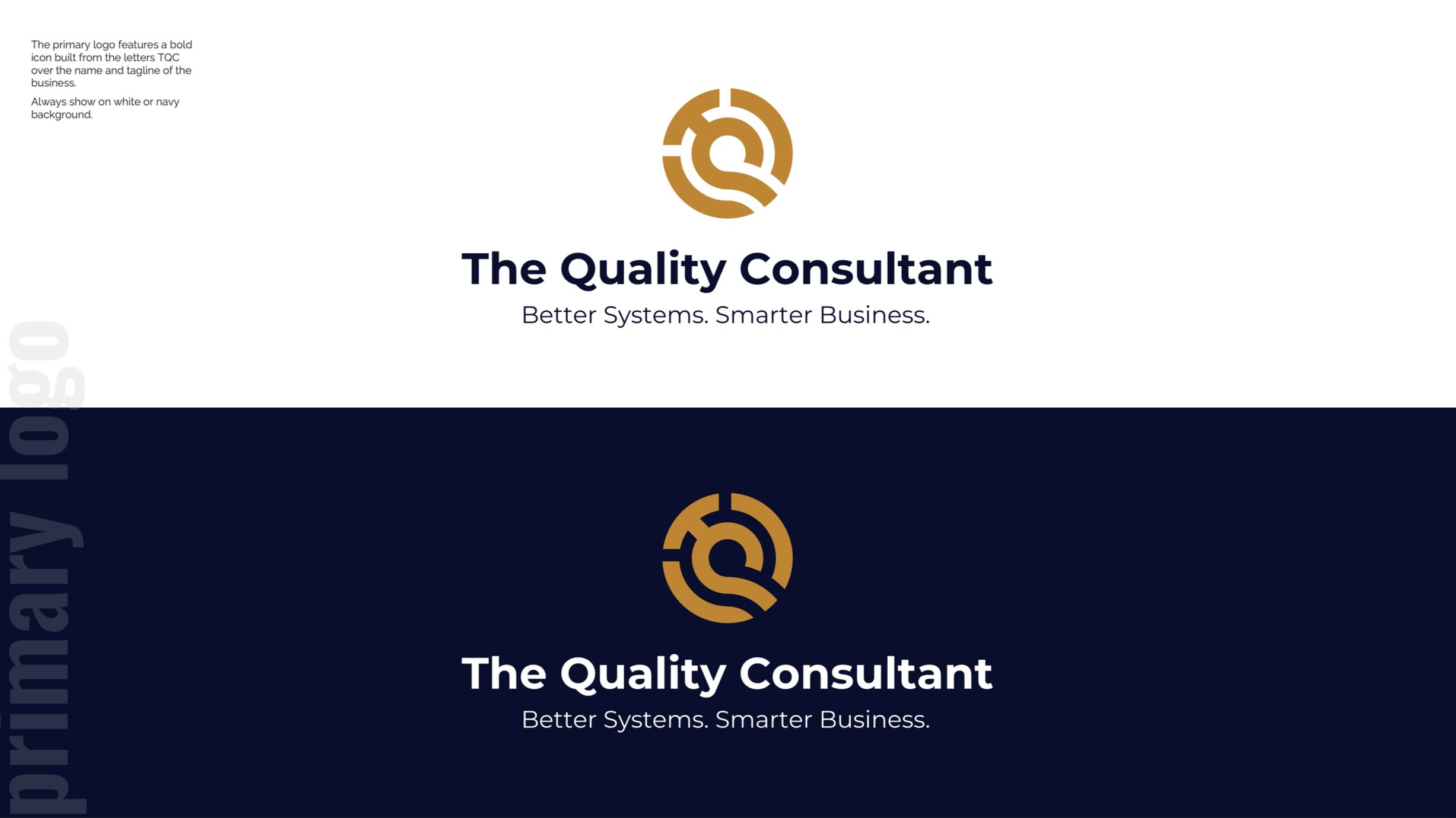
The client selected The Bold One, and after refining the shapes and alignment, I created primary and secondary formats for flexible application.
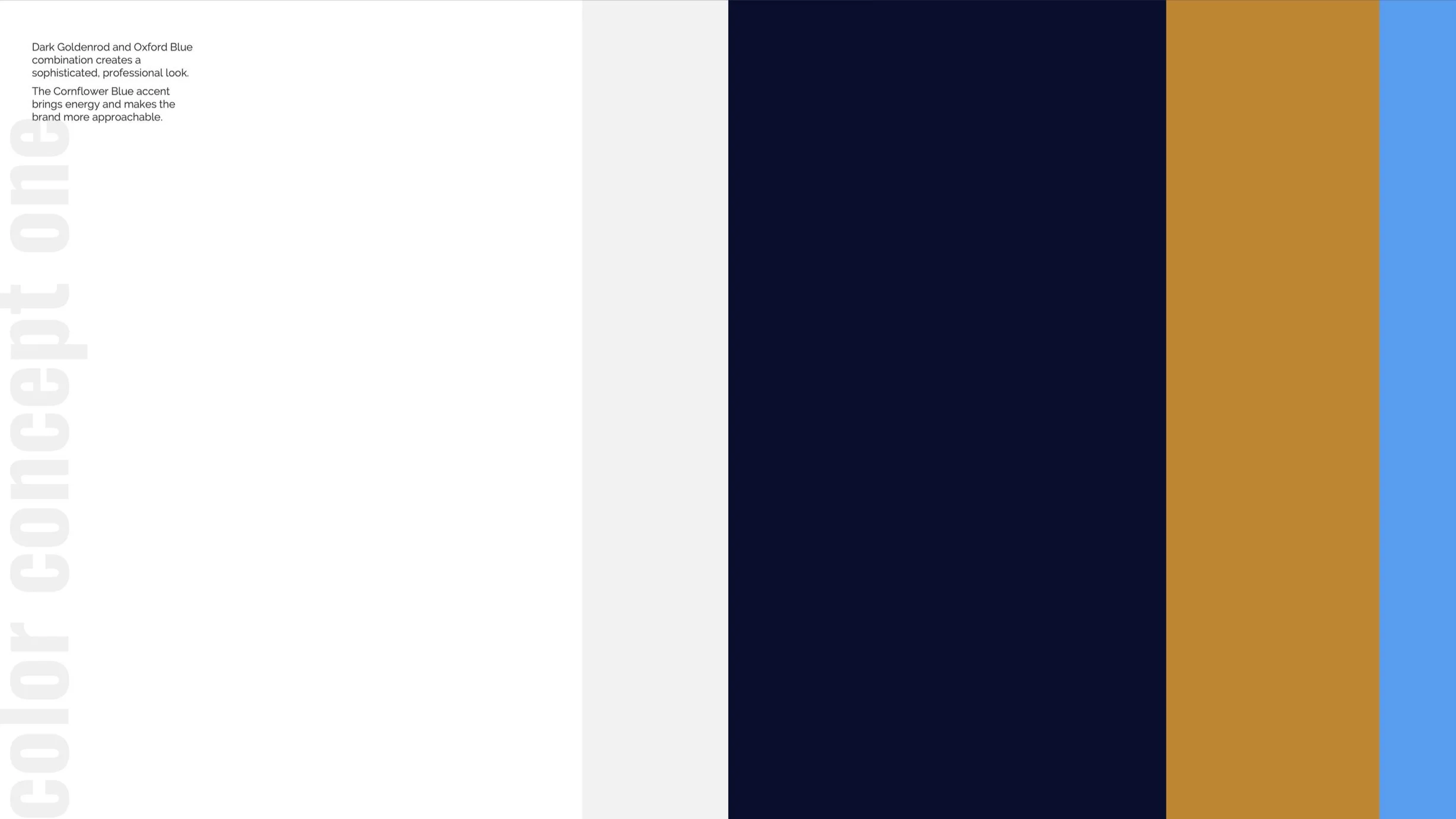
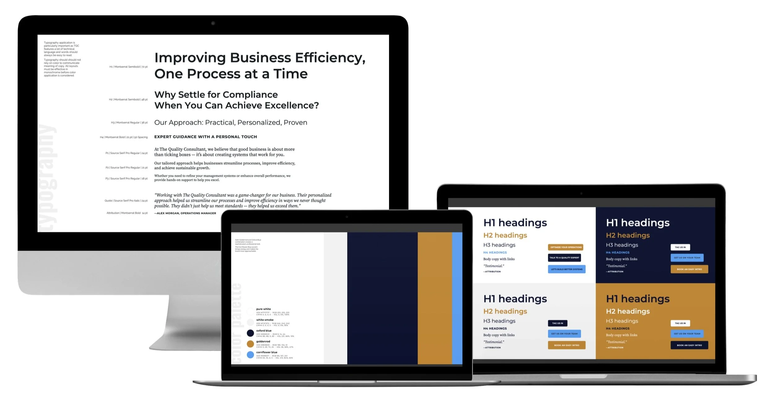
Color Palettes
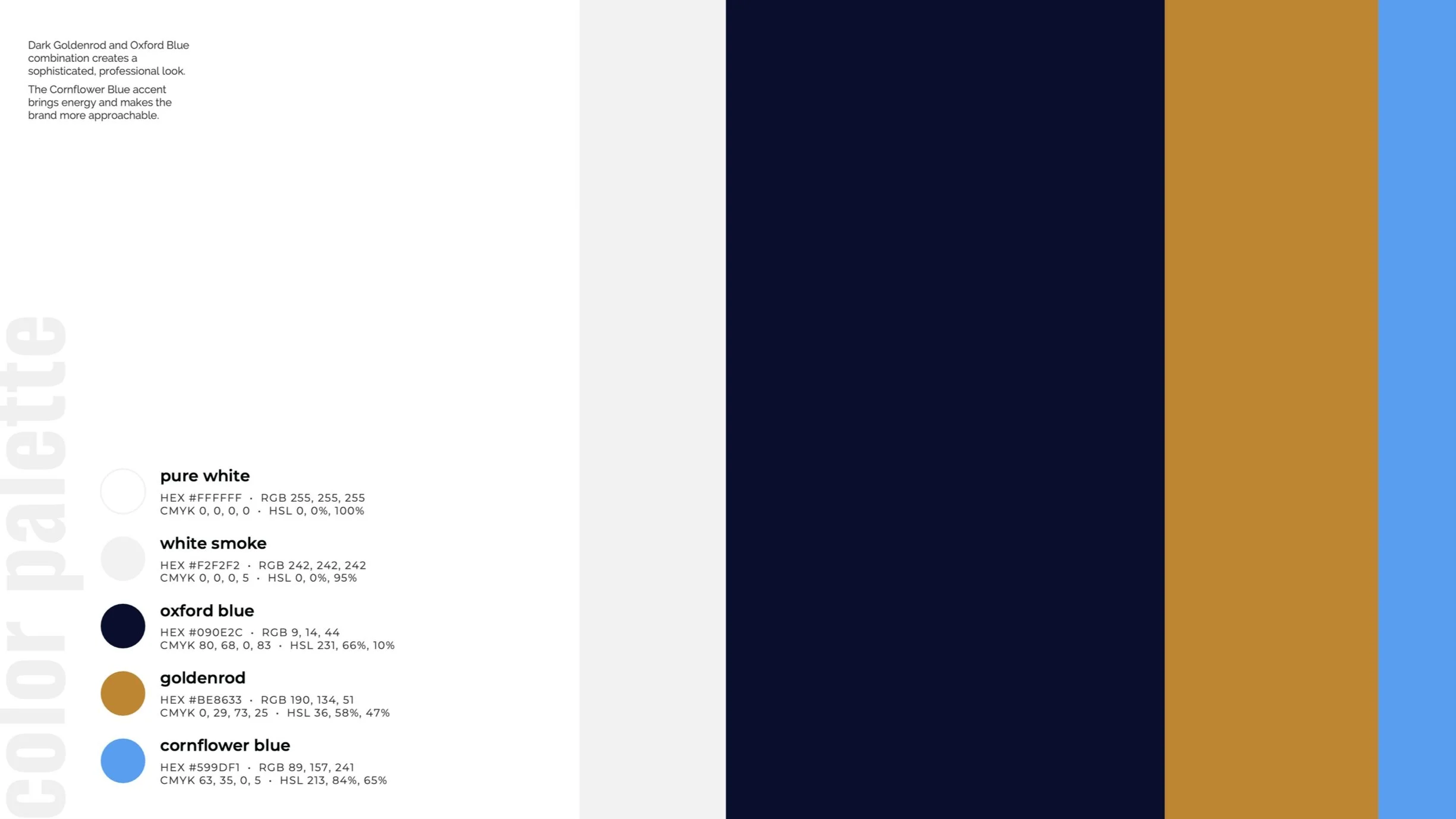
We explored three distinct palette options, all designed to convey professionalism without sterility. Option 1 was chosen for its calm strength and subtle energy.
2
Option 1
Dark Goldenrod and Oxford Blue, with Cornflower Blue as an accent. A strong balance of elegance and clarity.
Option 2
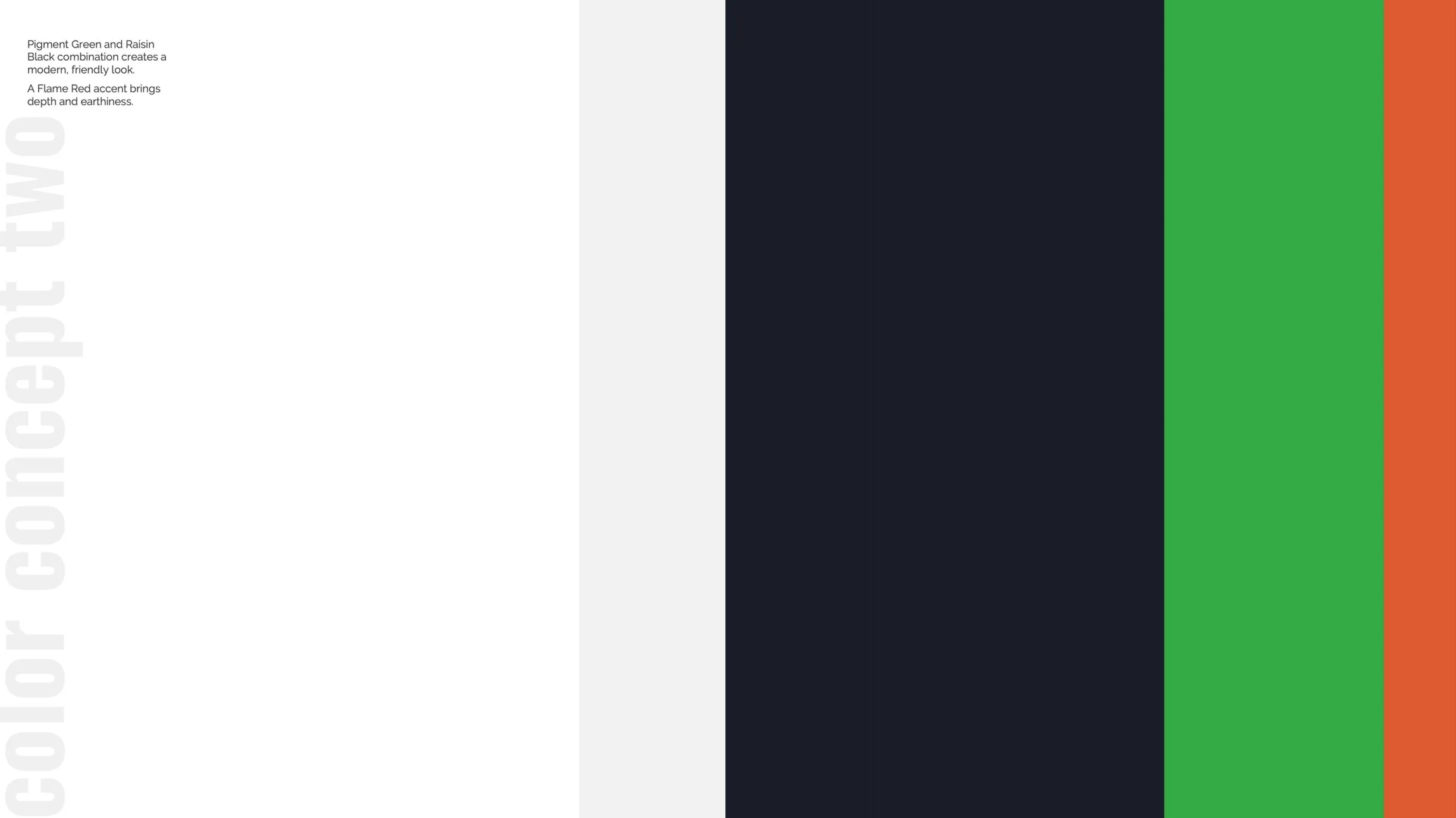
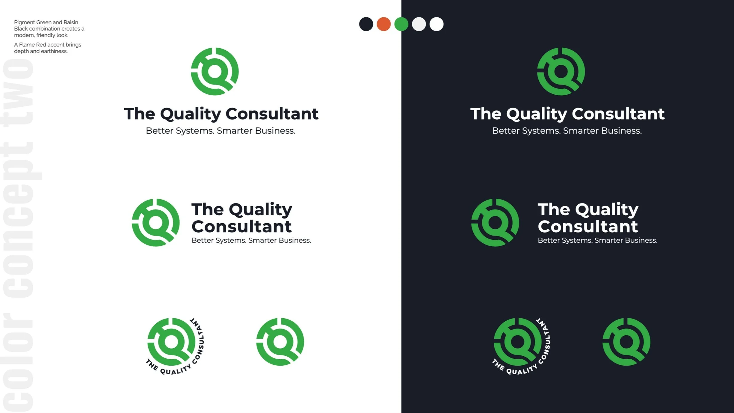
Pigment Green with Raisin Black, and Flame Red accents. Warm and modern.
Option 3
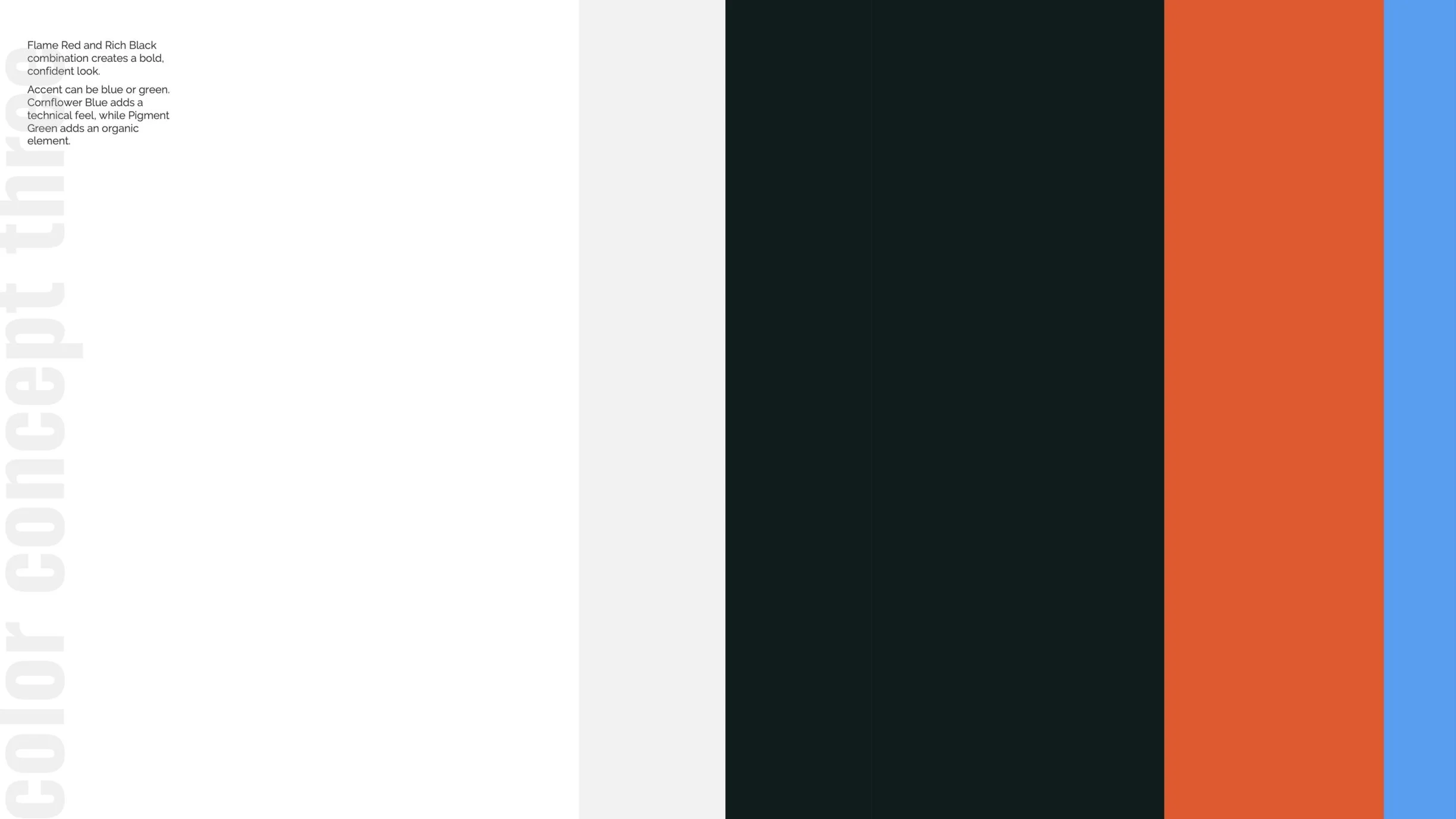
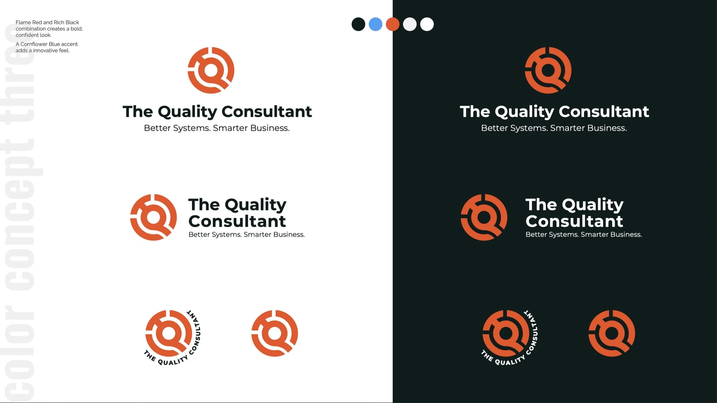
Flame Red and Rich Black with Cornflower Blue or green as accent. Confident and bold.
Typography
For typography, I selected legible Google fonts suitable for digital and print. Styles were specified for website design, including color guidelines.
3
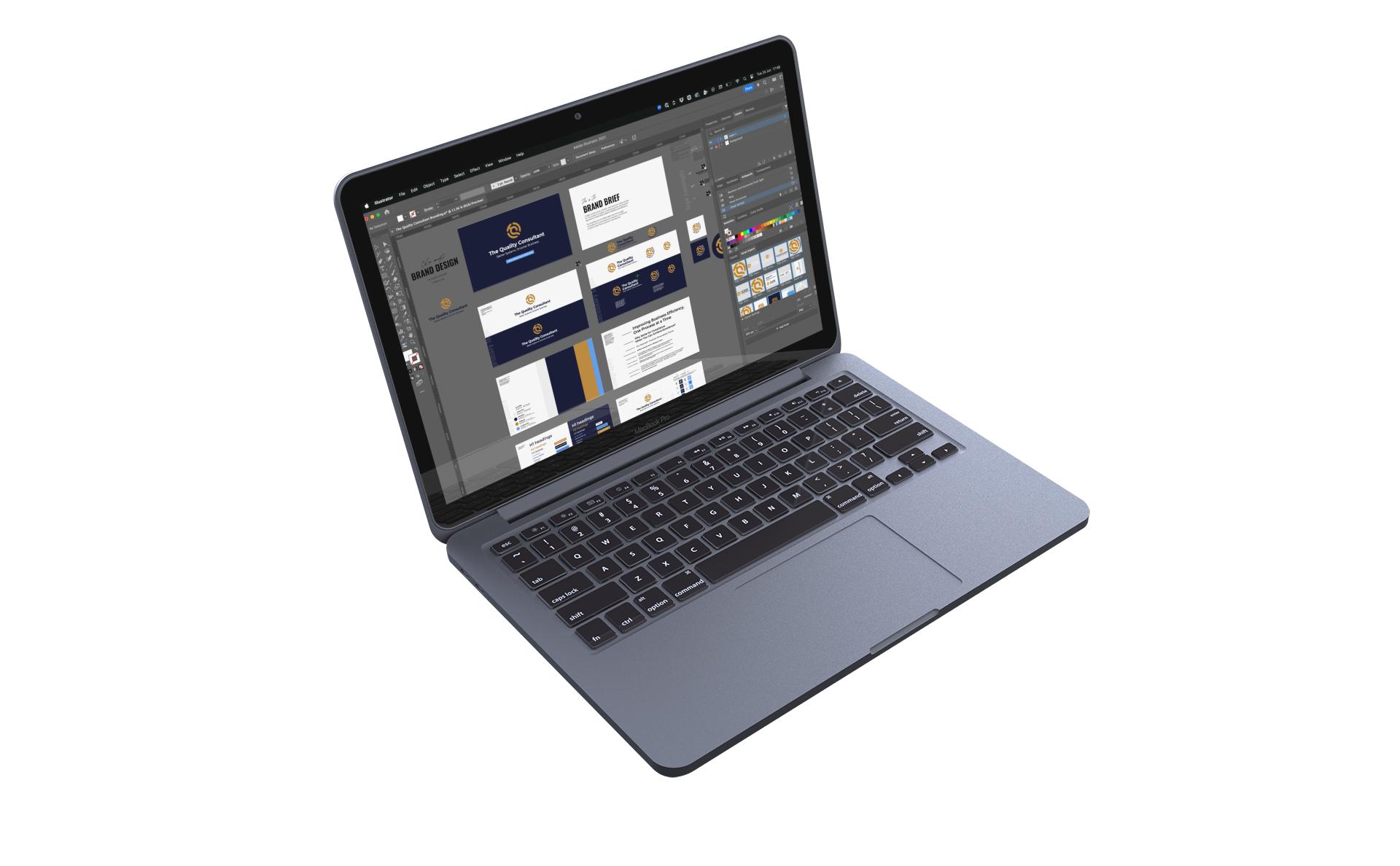
Brand Assets + Guide
With logo, colors, and typography set, I built out all the brand assets plus a comprehensive PDF brand guide—browse through it below.
4
-
![]()
Brand Guide Cover
with date it was issued
-
![]()
Project Brief
helps the project on track
-
![]()
Primary Logo
on light and dark backgrounds
-
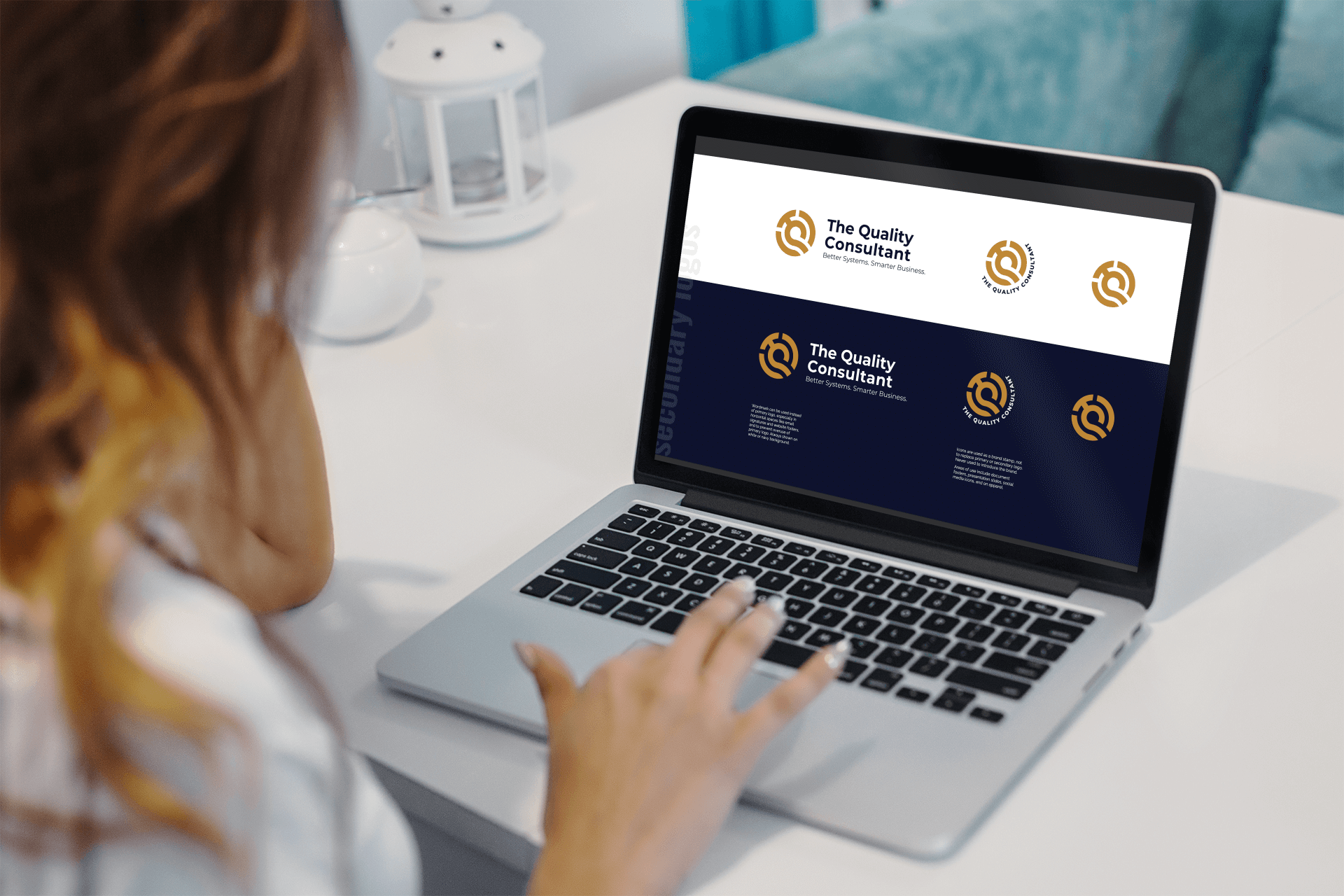
![]()
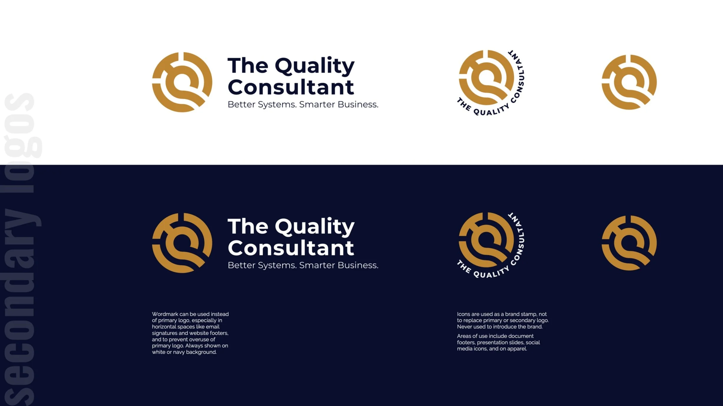
Secondary Logos
with examples of where to use them
-
![]()
Color Palette
with hex, rgb, cmyk, and hsl codes
-
![]()
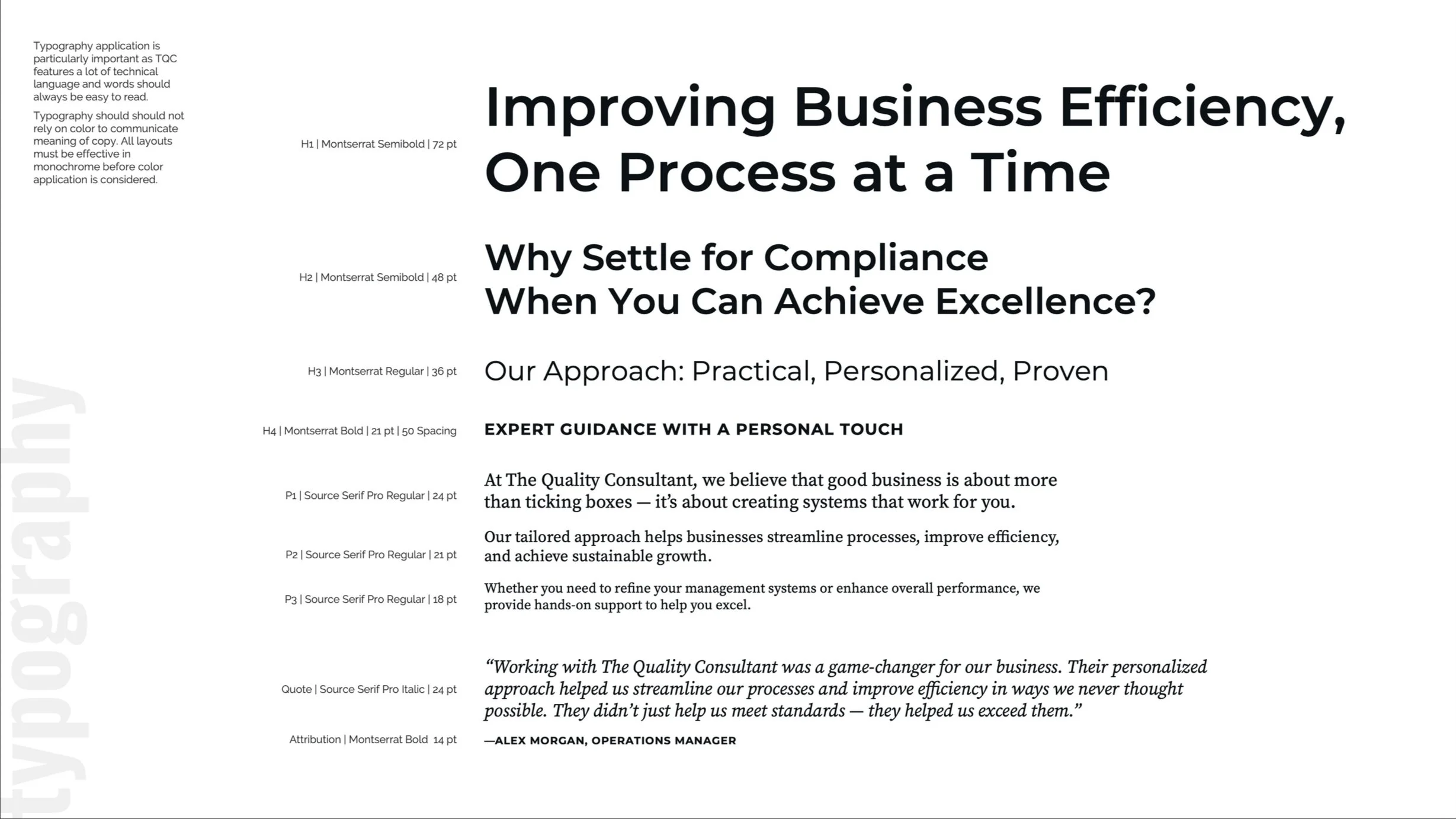
Typography Styles
set for H1 - H4, P1 - P3, quotes, and attributions
-
![]()
Font Color Guide
using brand colors
-
![]()
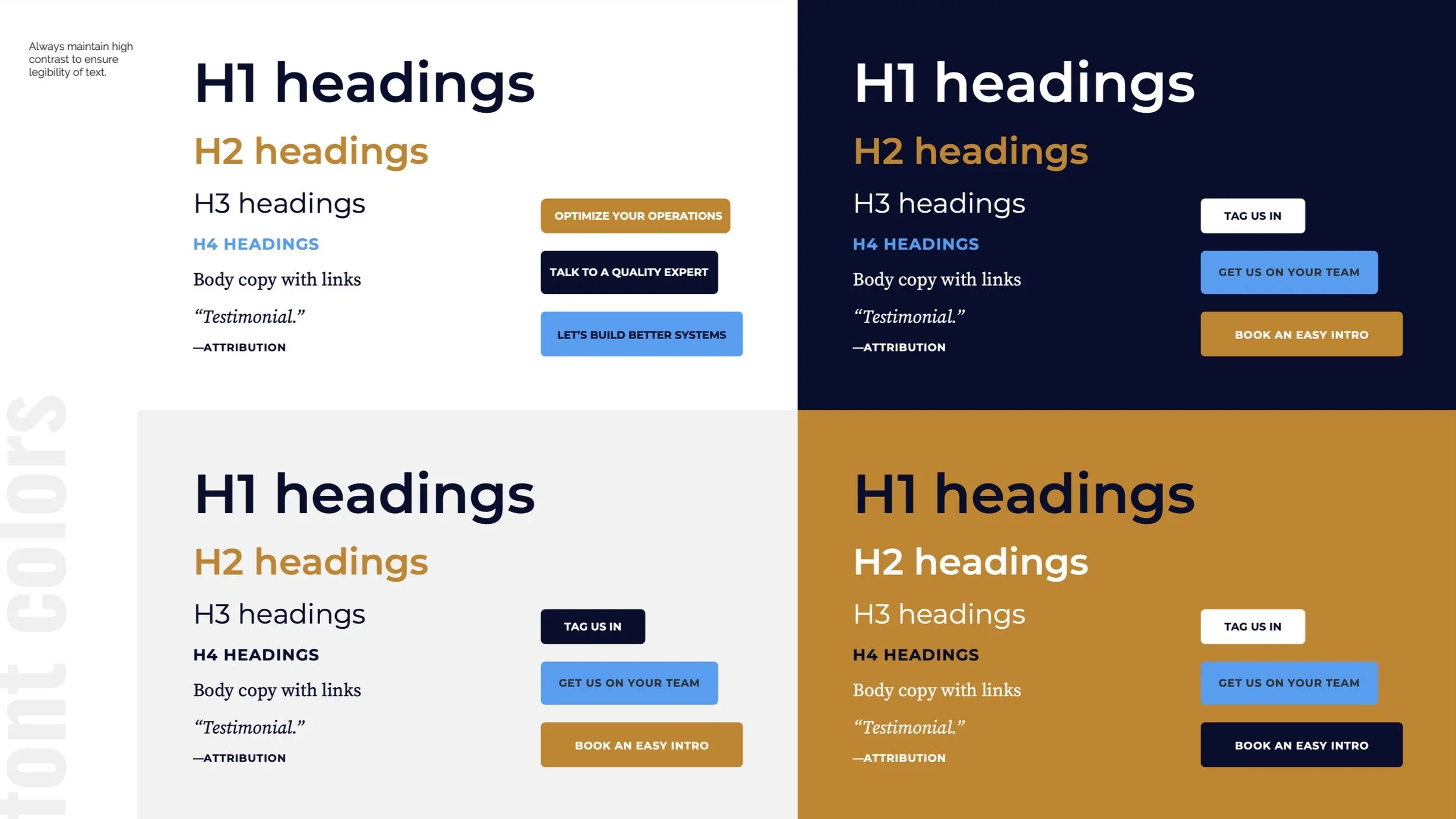
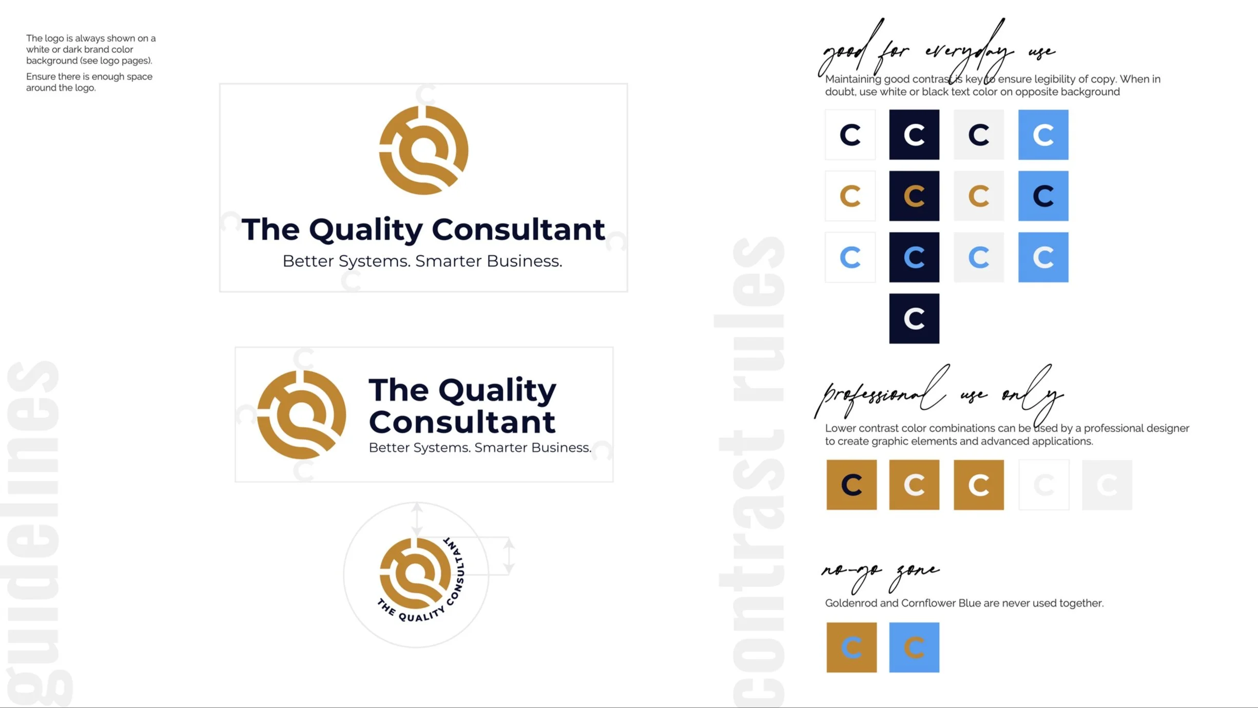
Spacing & Contrast Guidelines
to ensure legibility
-
![]()
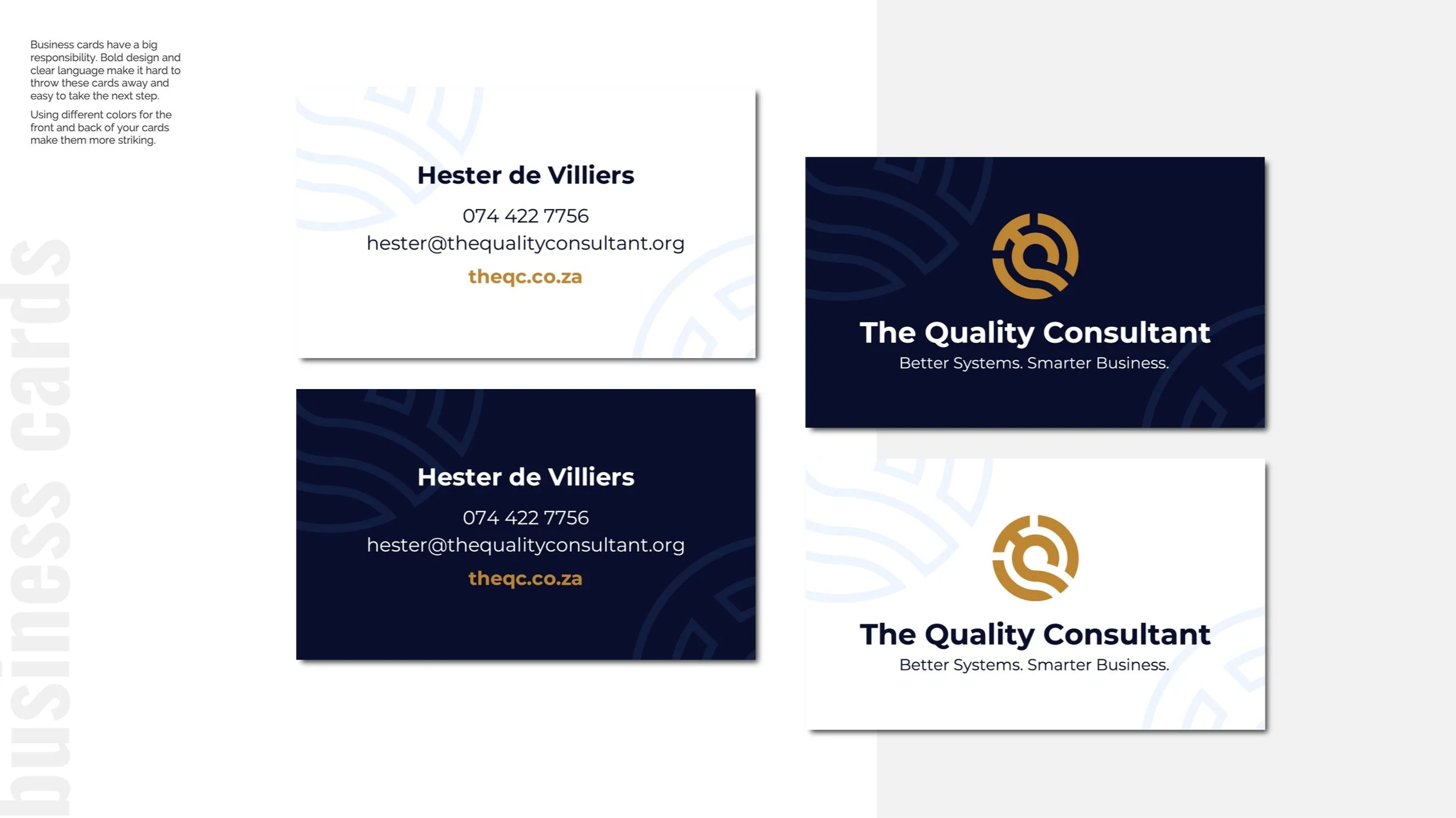
Business Cards
with light and dark backgrounds
-
![]()
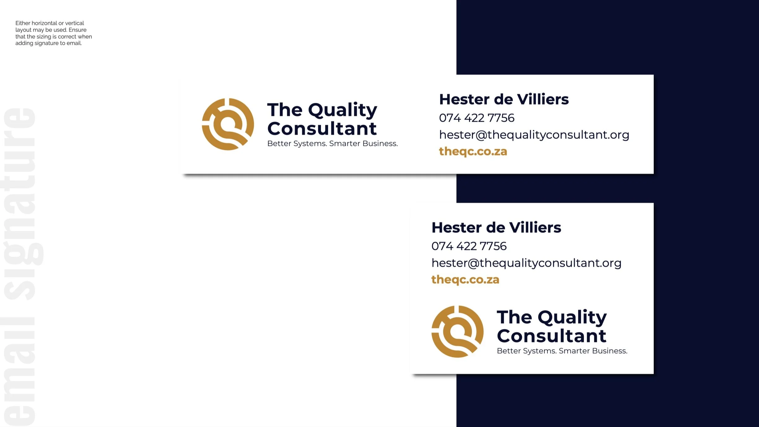
Email Signatures
desktop and mobile versions
-
![]()
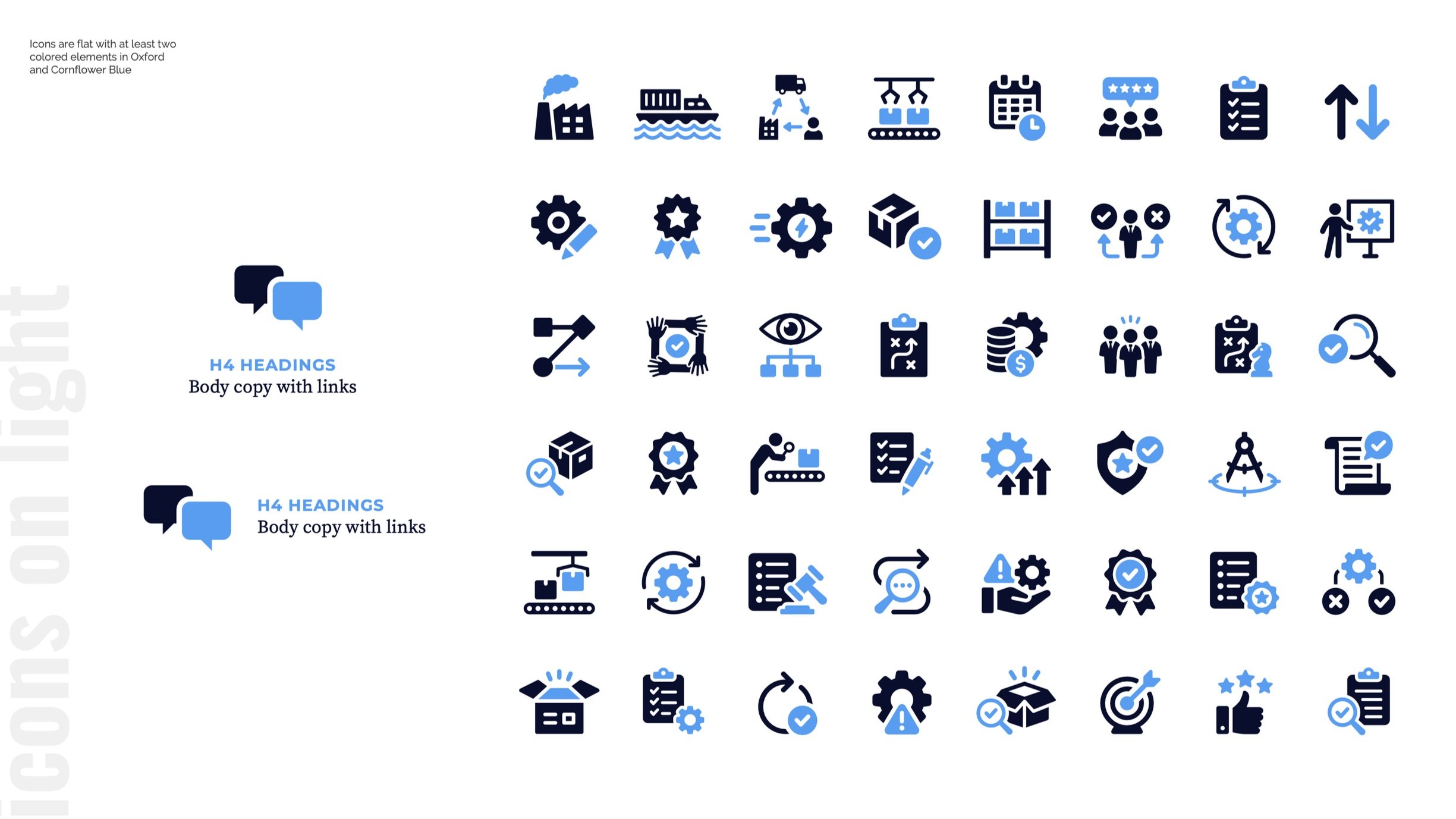
Themed Icon Set
for light backgrounds
-
![Themed Icon Set]()
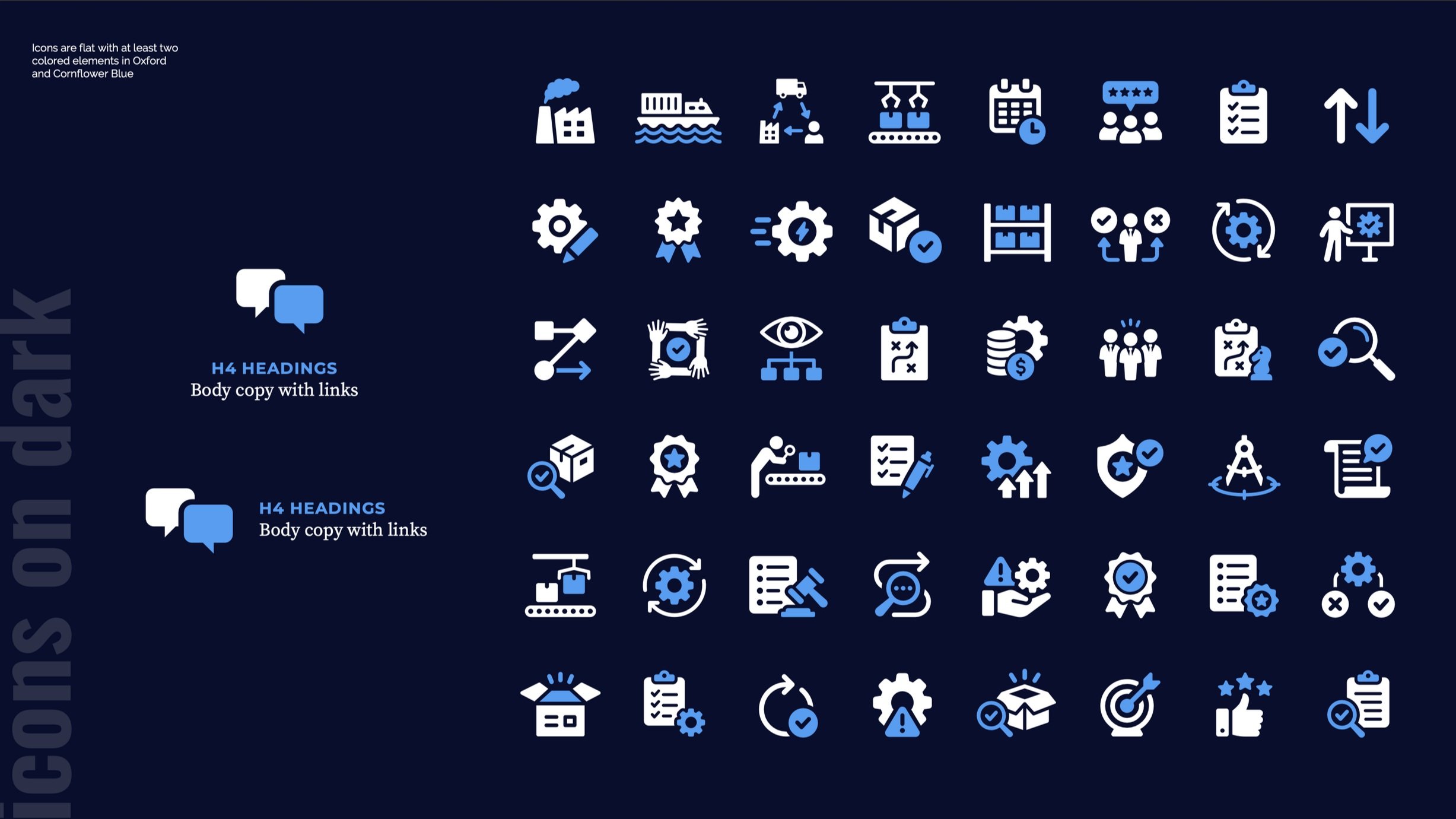
Themed Icon Set
for dark backgrounds
-
![]()
Logo Mockups
for apparel and print
-
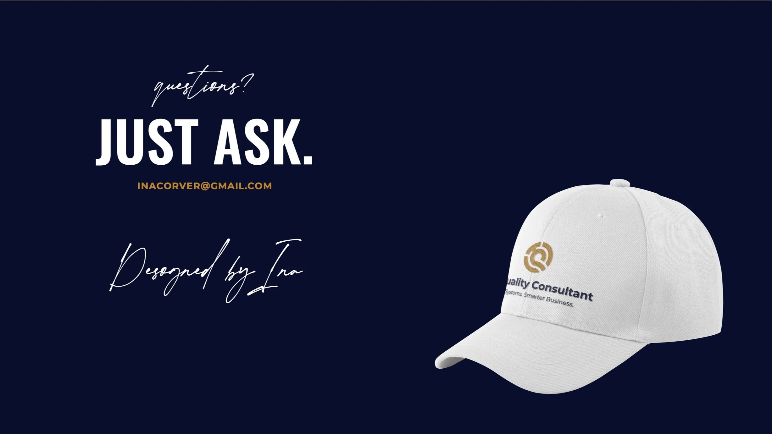
![]()
Brand Guide Wrap
with designer’s contact details

The final brand package included:
Primary and secondary logos (shown on approved background colors)
Color palette with HEX, RGB, CMYK, and HSL values
Full typography system (H1-H4, body styles, quotes, attributions)
Logo spacing and sizing rules
Font color usage and contrast guidelines
Business card and email signature designs
Themed icons for light and dark backgrounds
Mockups of branding on apparel and printed stationery
The client received a well-organized Dropbox folder with all assets, including an editable Adobe Illustrator file for future use.
Project Summary
This project gave The Quality Consultant a brand identity that matches their high standards and friendly service. With solid design fundamentals, carefully chosen color and type, and practical brand assets, TQC can now present themselves with the same confidence they bring to every client engagement.
What Next?
I built a robust Squarespace website using The Quality Consultant’s branding.
Want to look as good as the work you deliver?
Let’s bring your brand to life.