Case Study
The Quality Consultant
Visual branding and Squarespace website for a consultancy that helps businesses run better.
Client Overview
The Quality Consultant (TQC) is a boutique consultancy that specializes in improving management systems across industries, with or without ISO certification. Their work is thoughtful, hands-on, and designed to help clients do better business — but their brand and website weren’t pulling the same weight.
The Challenge
Visual Branding
TQC had a logo that was visually unclear (it often read as “TOC”), and no supporting brand system to hold everything together. Their business cards, email signatures, and templates looked inconsistent — a far cry from the high-quality, structured service they actually delivered.
Their slogan at the time, “Your success is our business,” didn’t speak to what they did or how they helped.
Website
They were using a self-built Wix site, but it lacked structure, clarity, and key messaging. Potential clients couldn’t tell what TQC offered, who they worked with, or what made their approach unique — and that meant a lot of unnecessary explaining in emails and calls.
Their site also unintentionally gave the impression that they only worked with clients pursuing ISO certification, which was misleading. Stock imagery and vague content didn’t reflect their values, expertise, or personality.
Strategy & Admin
TQC was managing consultation bookings manually — back-and-forth emails to find a time, vague client briefs, and no formal system for next steps.
Their domain (thequalityconsultant.org) was long, hard to remember, and created confusion around whether they were a nonprofit.
The Solution
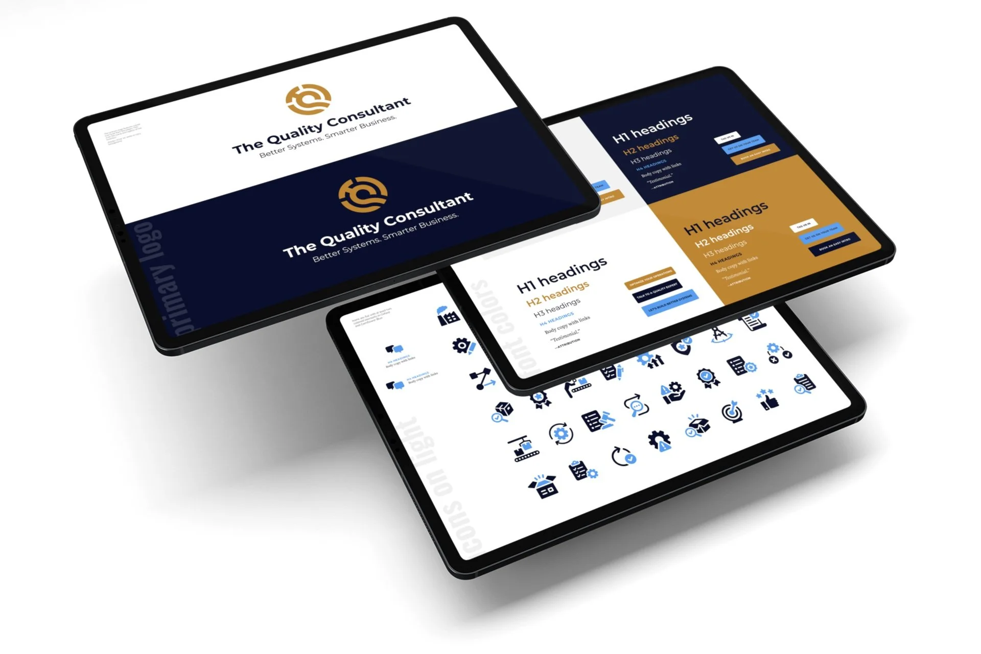
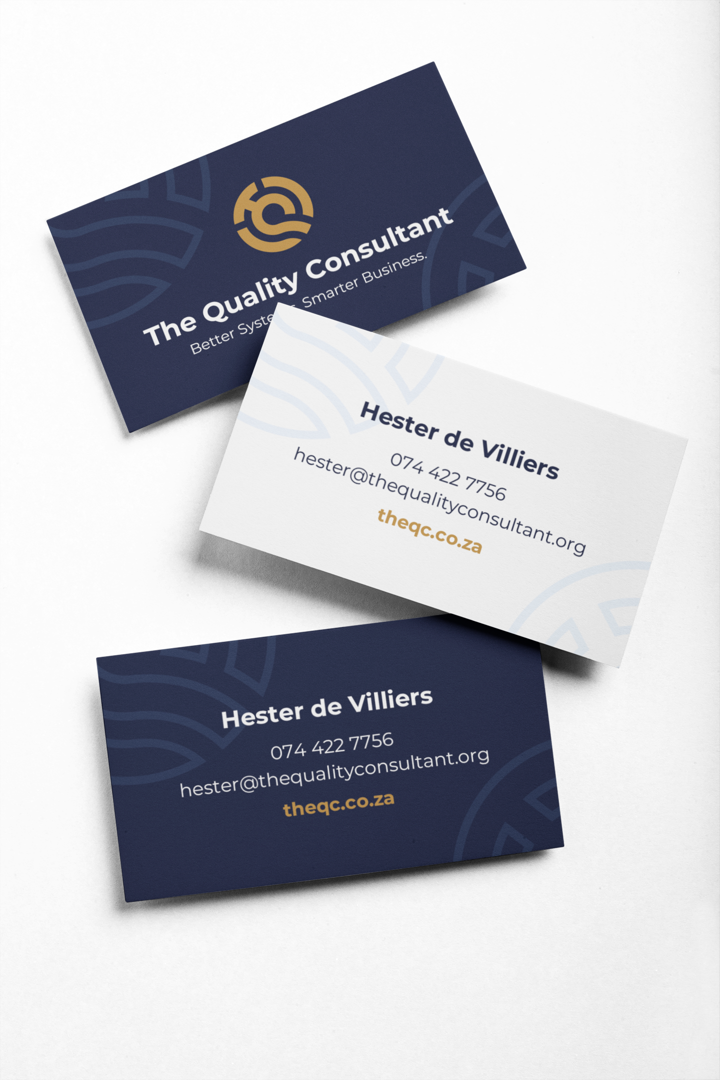
Calm but Confident Branding
We started by creating a structured visual identity that matched the clarity and professionalism of their work.
The new system included:
Primary and secondary logos
A calm but confident color palette
Readable, Google-friendly typography
A simplified slogan: Better Systems. Better Business.
Brand icons for use in presentations
Professionally designed business cards and email signatures
A brand guide to help them stay consistent as they grow
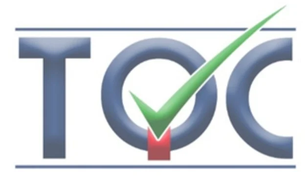
Original logo before the visual brand project
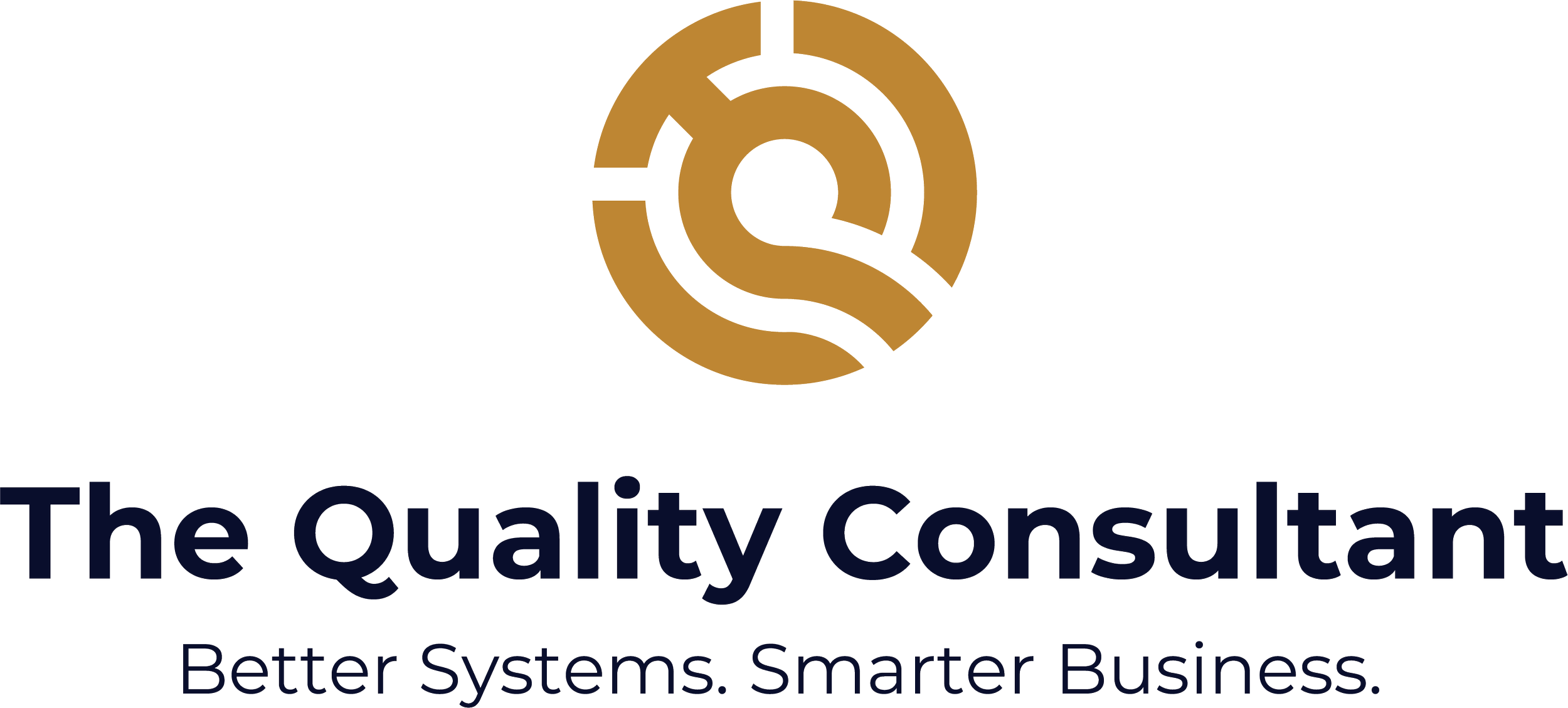
New logo after project completion
peek behind the curtain
The new logo made my client (and their clients) do a happy dance! See the design process in action >
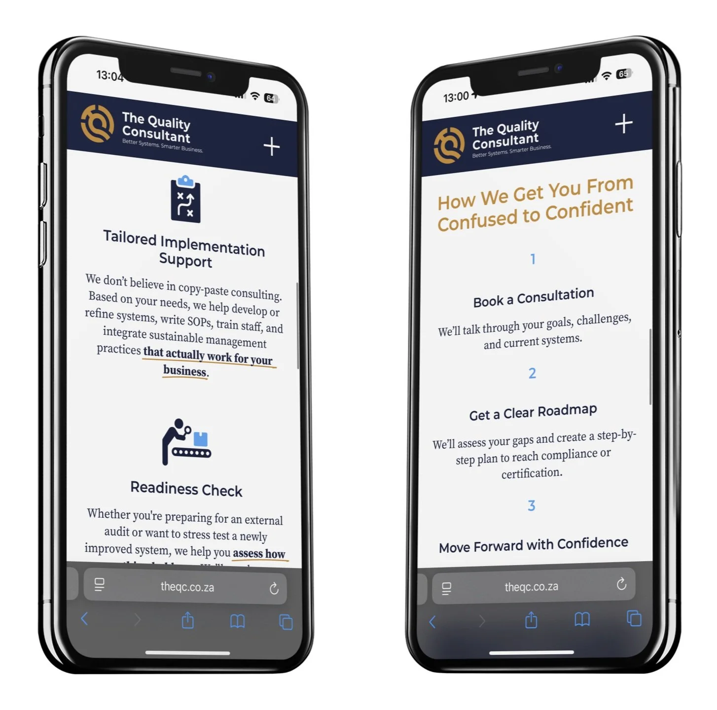
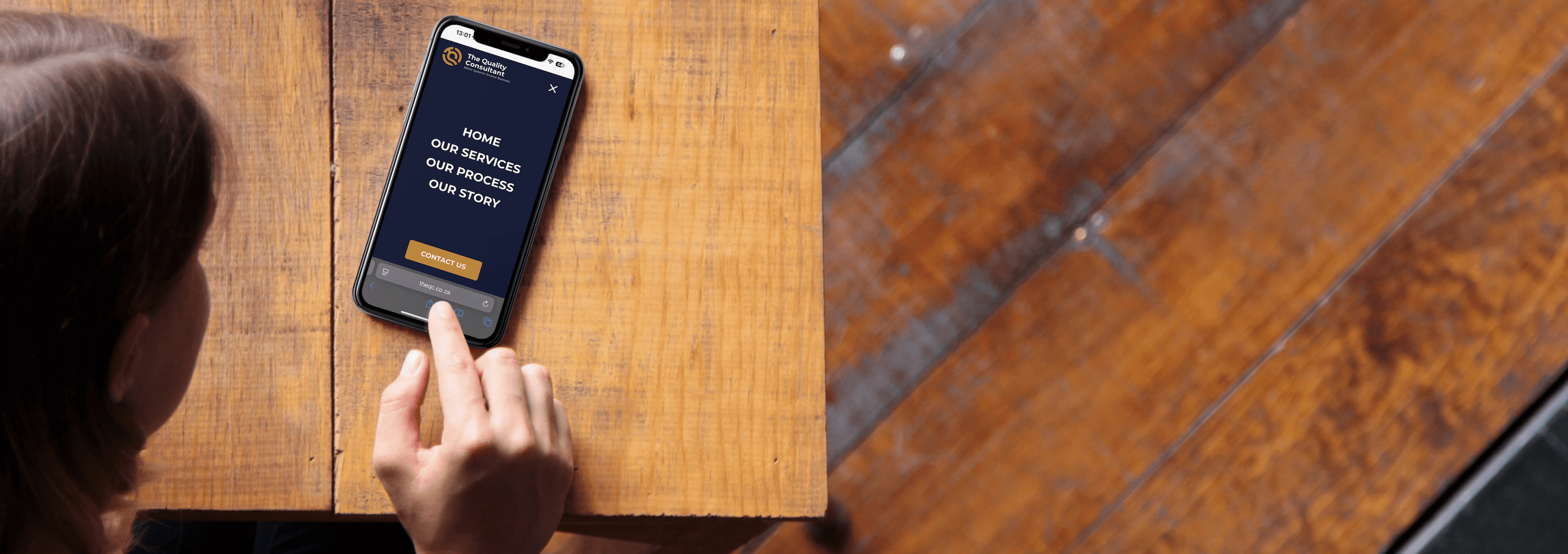
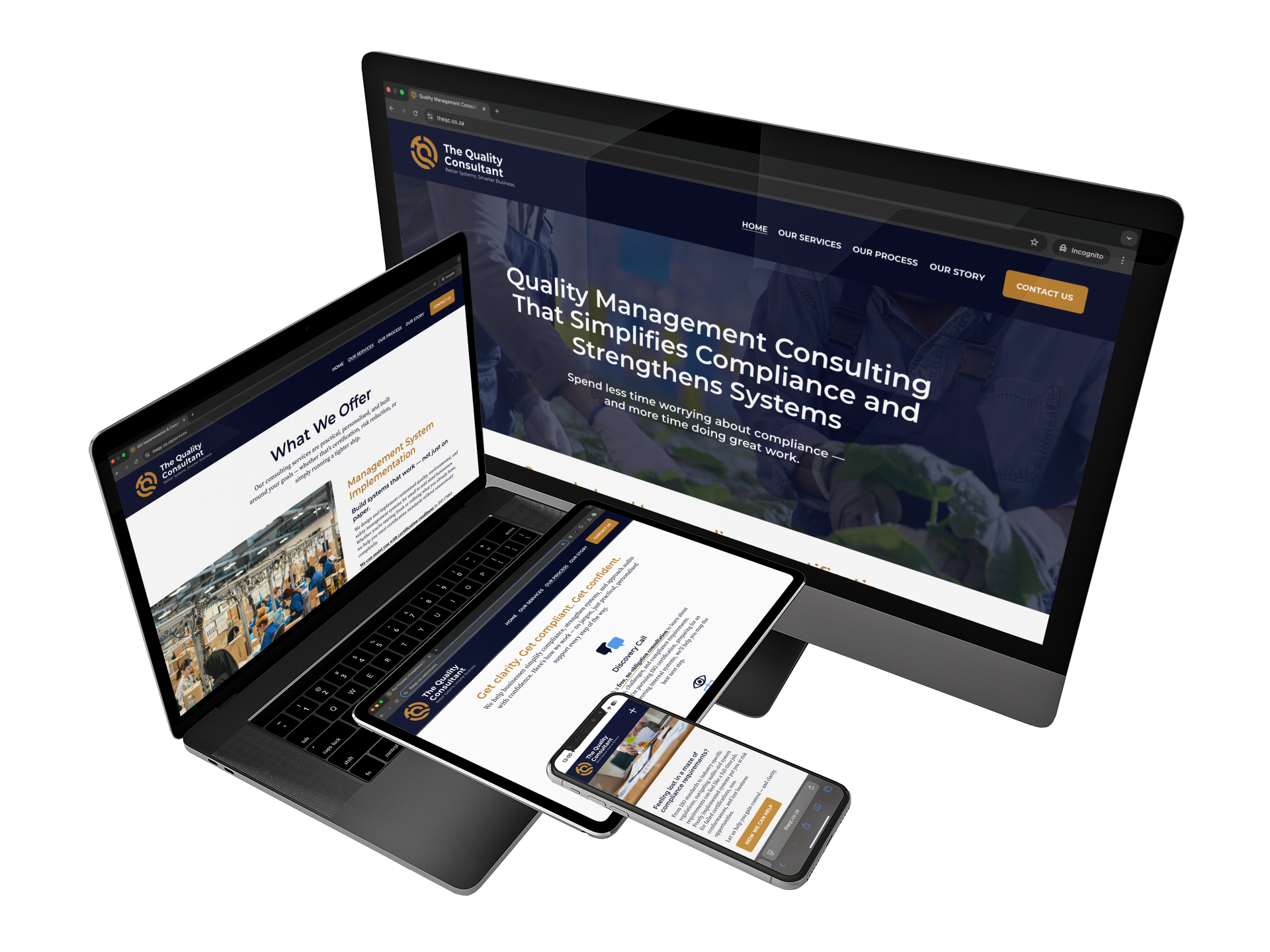
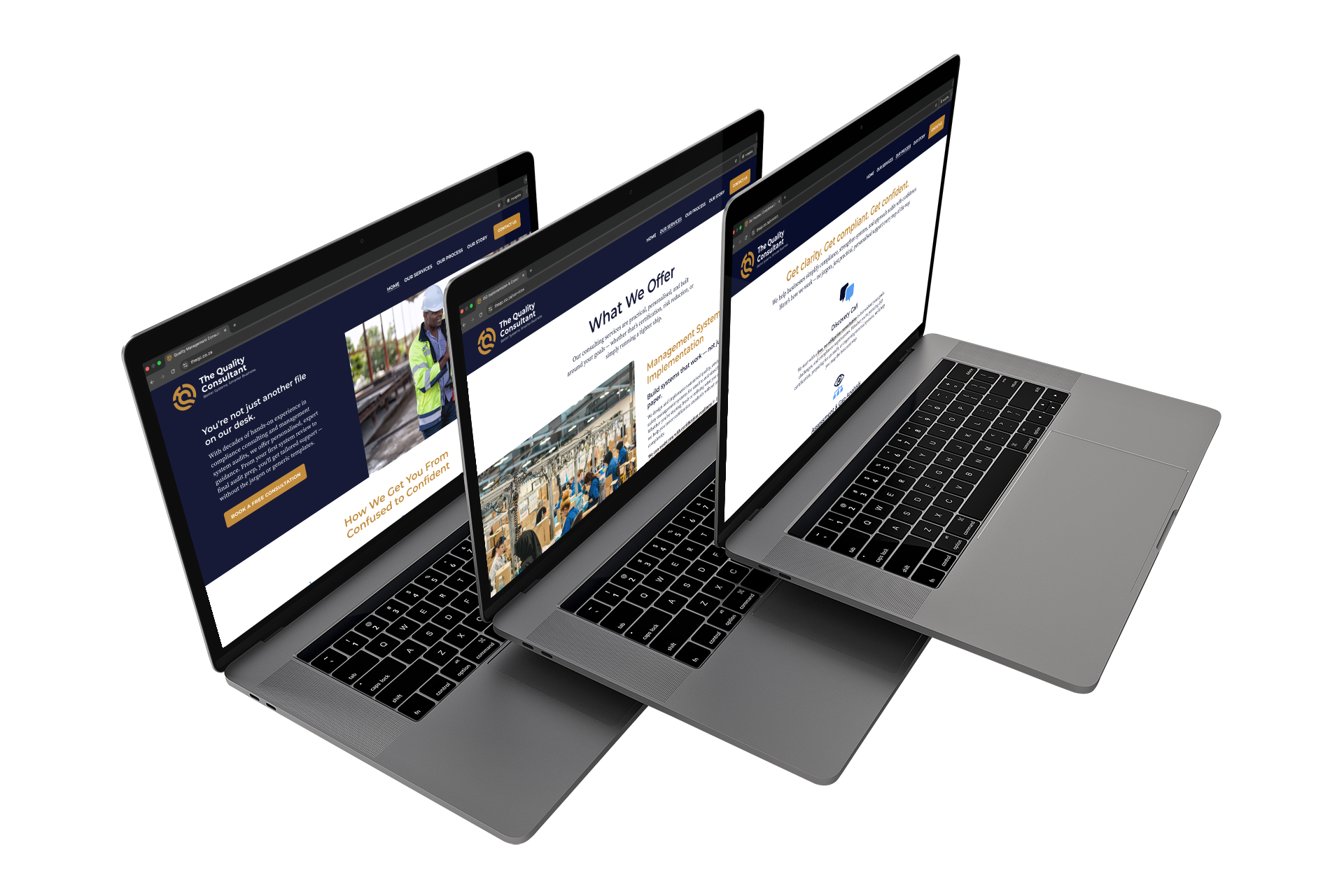
A Website That Works Like an Employee
We rebuilt the TQC website from the ground up in Squarespace, following the Storybrand style. The goal was to turn their site into a silent but effective sales rep — one that educates, qualifies, and supports leads before they ever pick up the phone.
Key pages and features include:
A Homepage that names client pain points and positions TQC as the expert guide
A Services page that explains what TQC offers, who it’s for, and clears up misconceptions
A Process page that walks clients through each step in plain English, with minimal clutter and a clear CTA
An About page that builds trust by demonstrating an understanding of client needs and connects through shared values and a founder bio
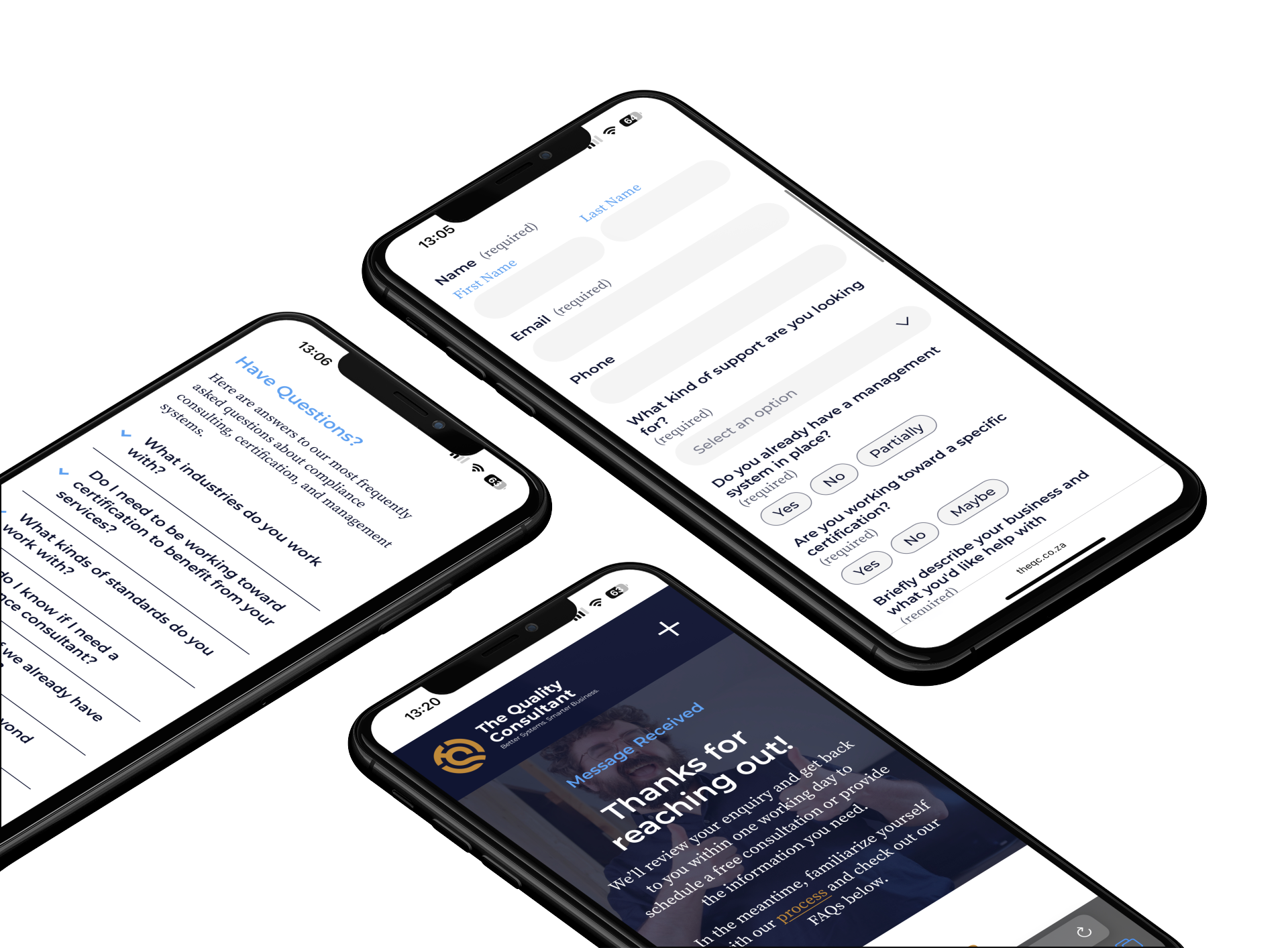
A Contact page with an FAQ section and simple dropdown form that redirects to a “Message Received” page with next steps
Custom FAQs that reduce email volume by answering common questions upfront
A 404 page that reflects the brand’s voice and redirects people quickly
SEO-optimized titles, descriptions, and alt text to support discoverability
Real, relevant imagery that reflects the people and industries TQC serves
Smarter Systems Behind the Scenes
To streamline calls and avoid email tennis, I set up a Calendly booking system integrated with TQC’s Google calendar. Clients can now pick a time that suits them and receive instant confirmation — no admin required.
We also:
Set up their new domain: theqc.co.za, a clear, memorable upgrade
Transferred and connected domains via GoDaddy
Switched their email to Google Workspace for better reliability
Installed new branded Gmail signatures
Delivered personalized Loom video tutorials for managing the site post-launch

Highlights
Clarified the brand and made it visually legible
Created systems to save time, reduce admin, and empower clients
Reframed the business as a solutions-focused consultancy, not just a certification service
Designed a website that pulls its weight — attracting, educating, and qualifying leads
Improved professionalism across first-touch materials (email, cards, site)


Project Outcome
TQC now has a visual identity and website that reflect the clarity and quality of their work — and systems that save them time and position them more strategically in their industry. The site delivers better leads, and the brand supports trust from the first click.
Client Feedback
“I loooooove it!! The videos look amazing! Thank you. I’m so excited by what I’m seeing… soooo cool!!!”
“The photos work well, we can definitely keep all of them.”
“We can be more specific on the ISO certification codes, but otherwise I’m doing a happy dance about the entire effect!”
Want Results Like These?
Tools Used