Portfolio: Design Process
Fisher Creative
A bold identity inspired by big adventures and natural light.
Project Brief
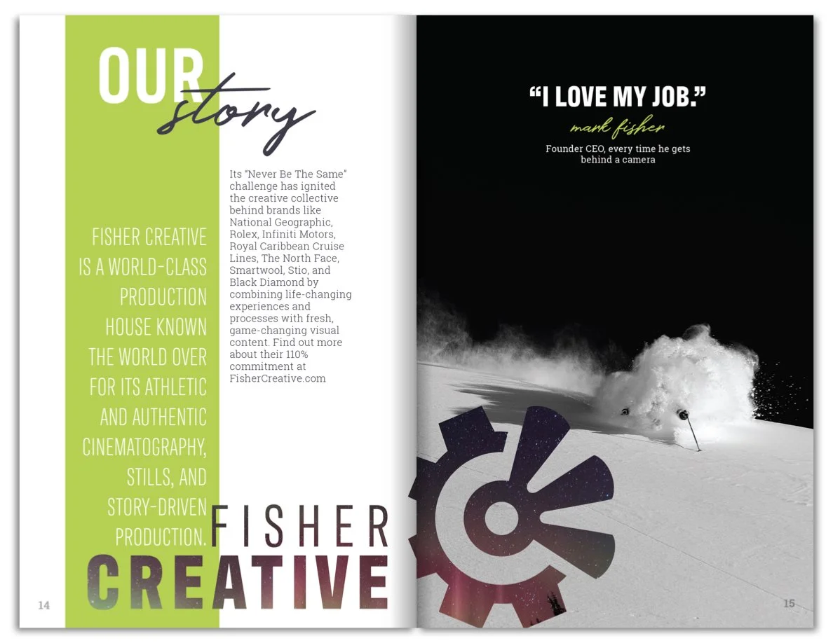
Fisher Creative is a premier US-based media production company that partners with some of the biggest names in adventure storytelling, from National Geographic to Red Bull.
They approached us with a clear goal: refine their existing logo, build a brand system around it, and design brand assets that matched the energy and color of their work.
Deliverables included an updated logo, color palette, typography system, business cards, email signatures, and custom icons.
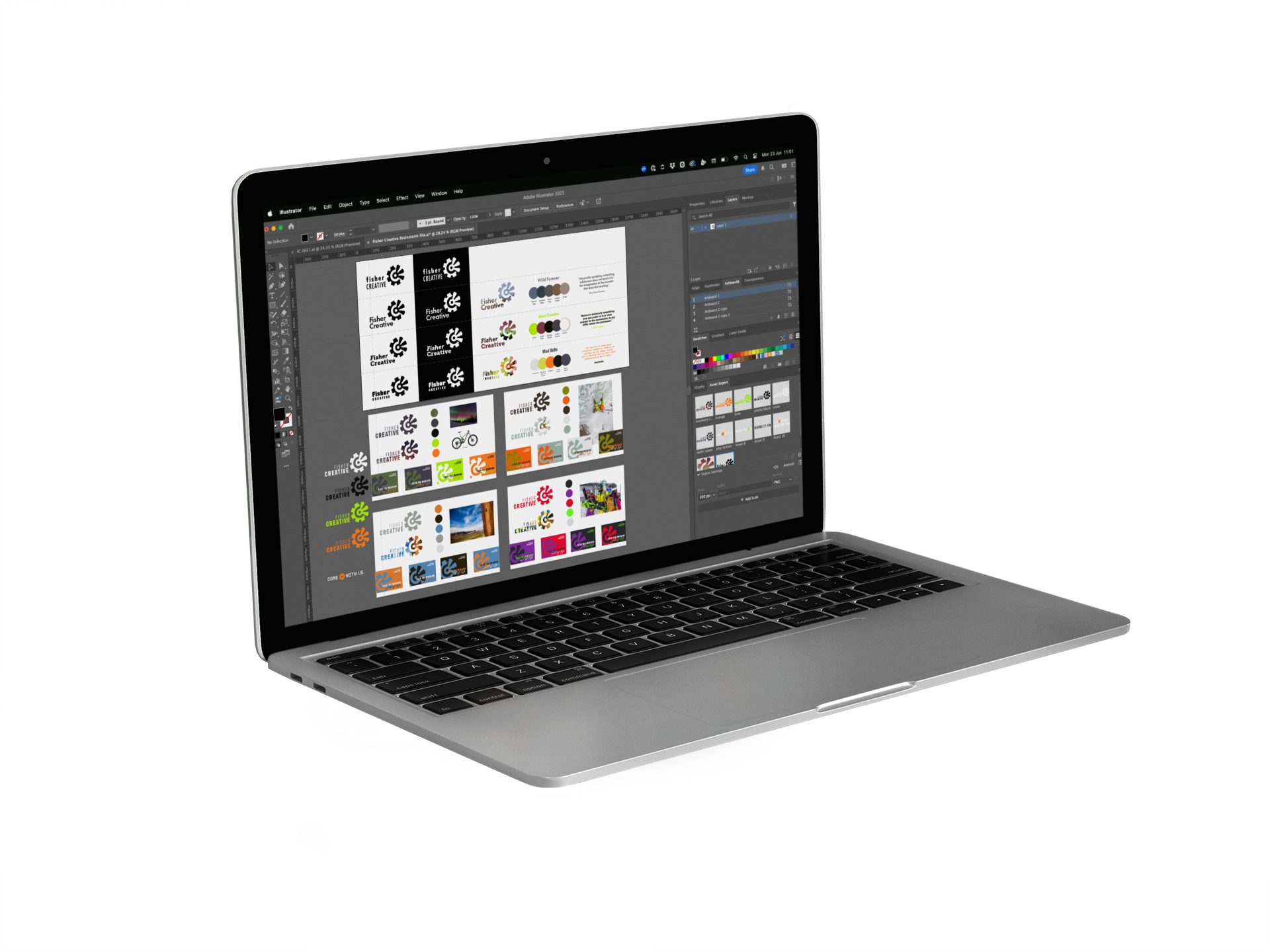
The process
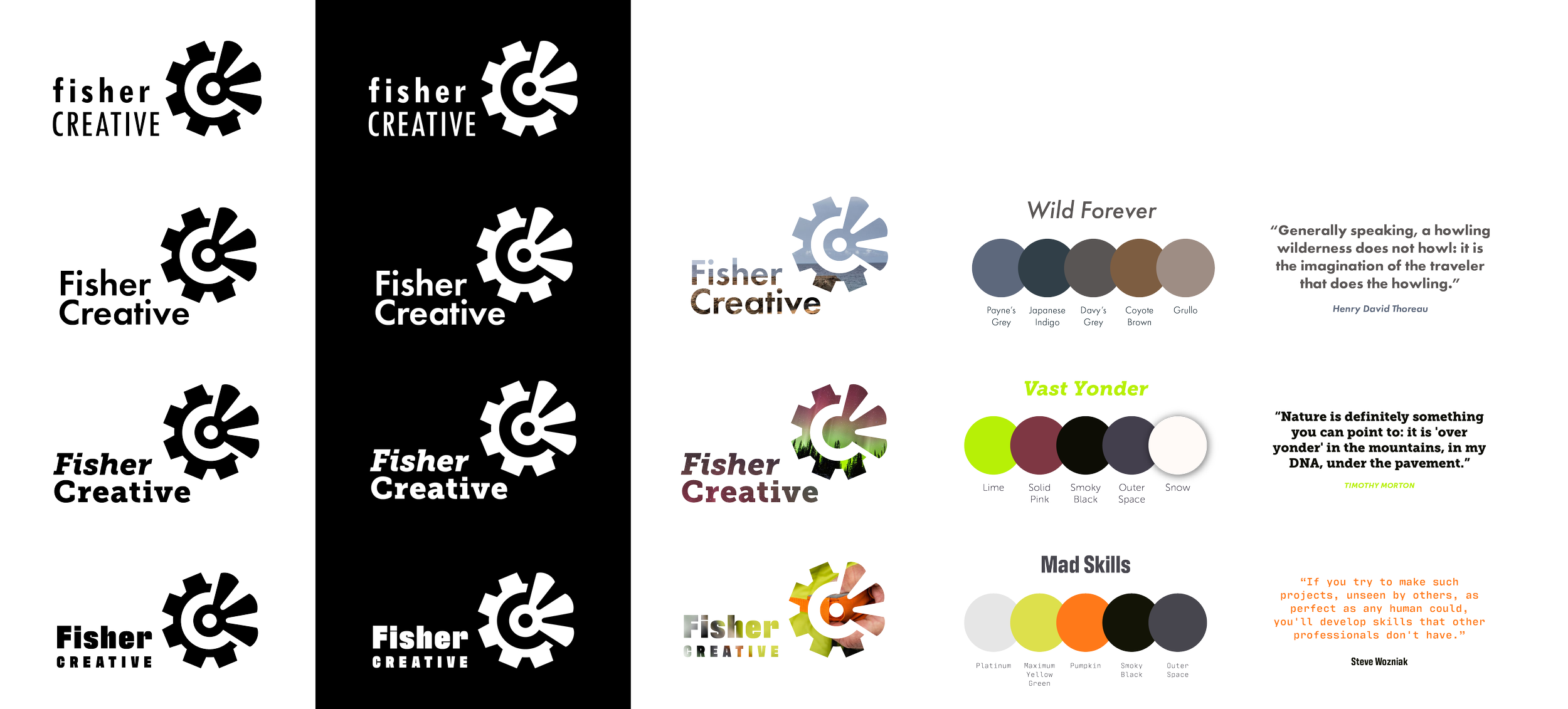
Logo Refinement
The existing logo had potential—a strong name paired with an iconic graphic—but the layout (text left, icon right) felt unbalanced and uneasy.
1
I retained the logo layout per client request and tested multiple alignments and fonts to create a better visual relationship between the two elements.
2
The final logo uses the bold, condensed Antarctican font, right-aligned with the icon. It shifts emphasis to the word "CREATIVE," allowing the icon space to breathe and shine. This subtle shift gave the logo the clarity and presence it needed without abandoning the brand’s existing equity.

Original logo before branding project

Updated logo after brand refinement
We also developed secondary and alternate logo formats that allow the brand to work flexibly across various media and color environments, including applying Fisher’s own photography as a fill within the logo icon.


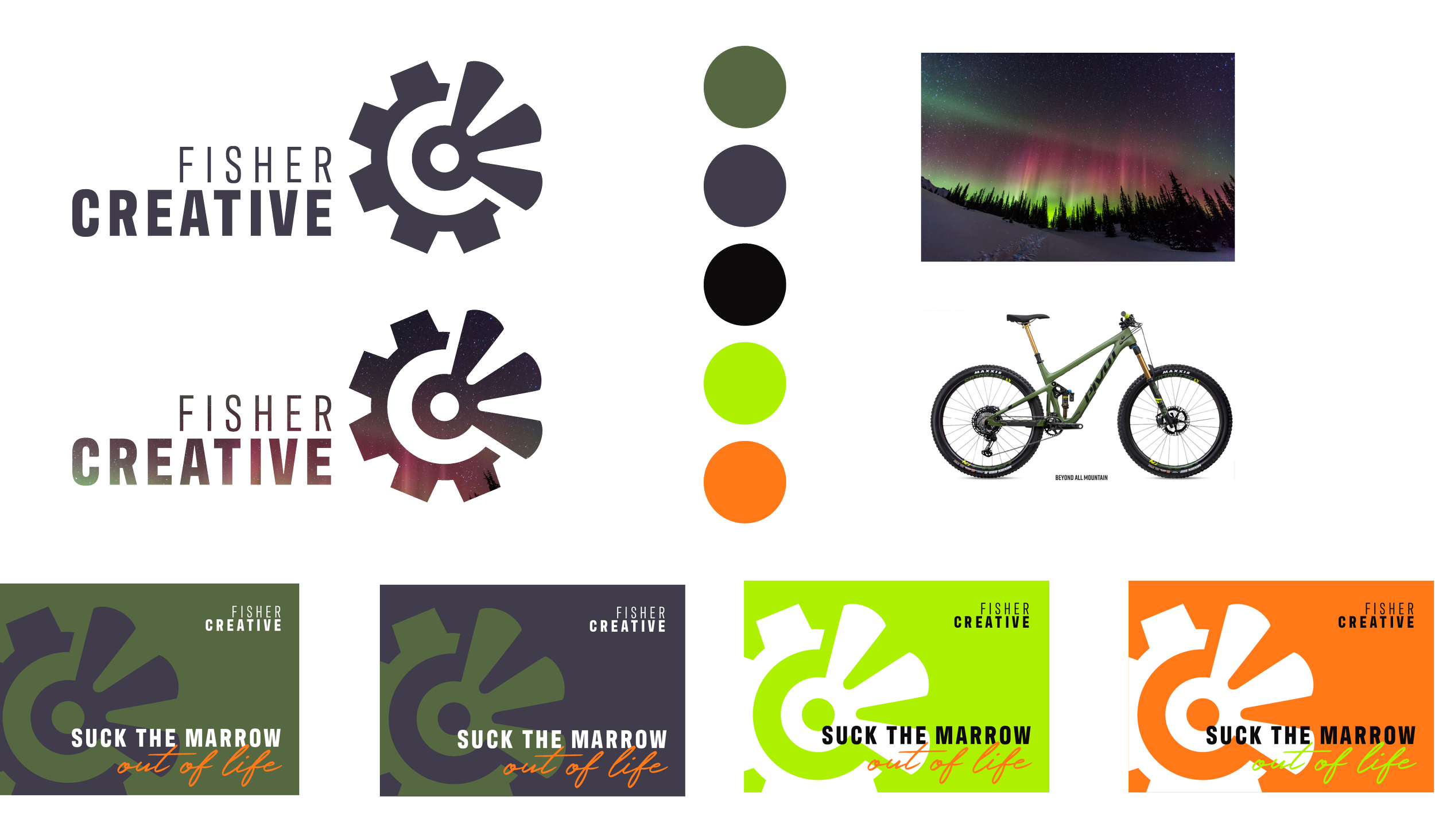
Color + Typography
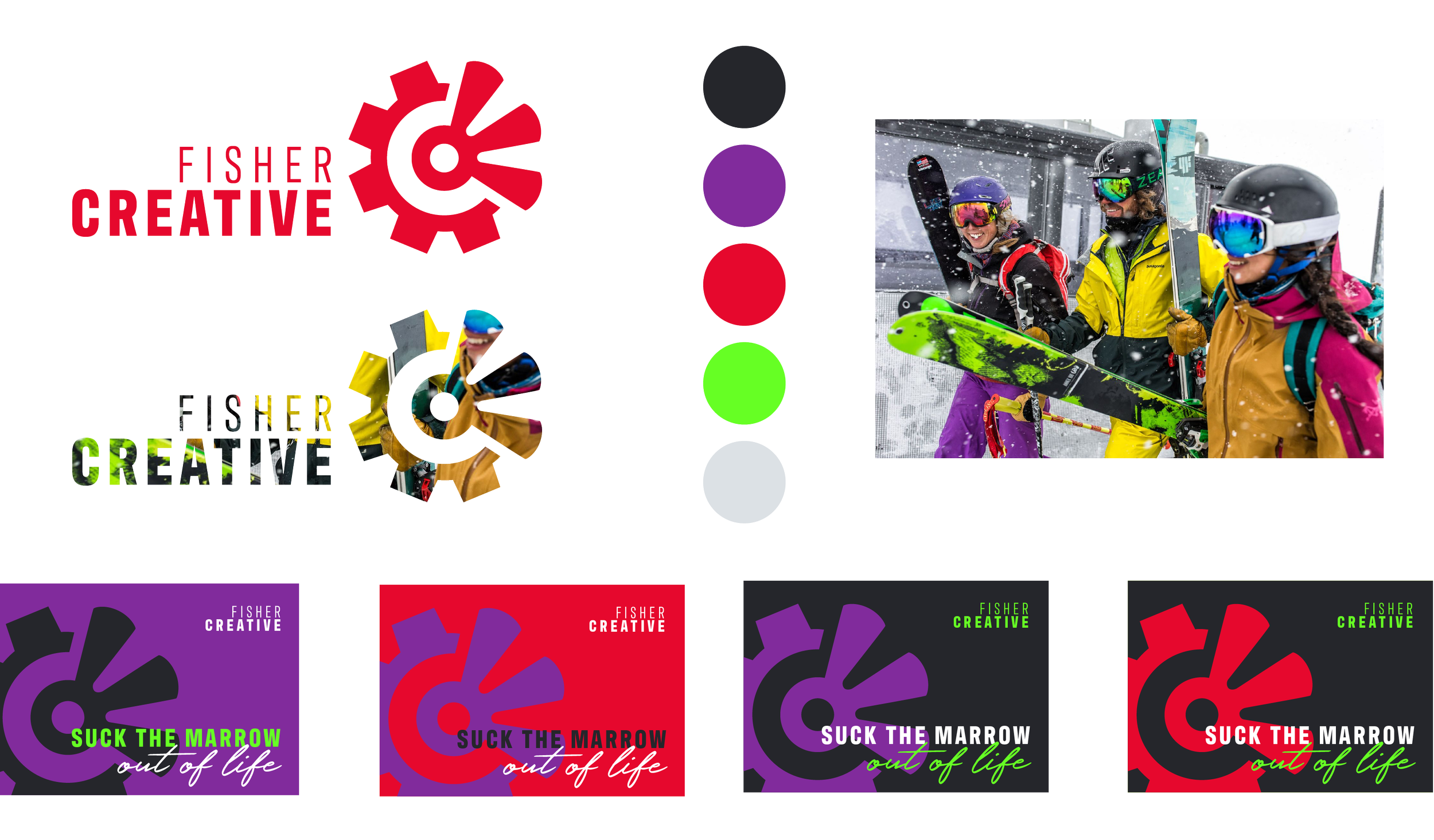
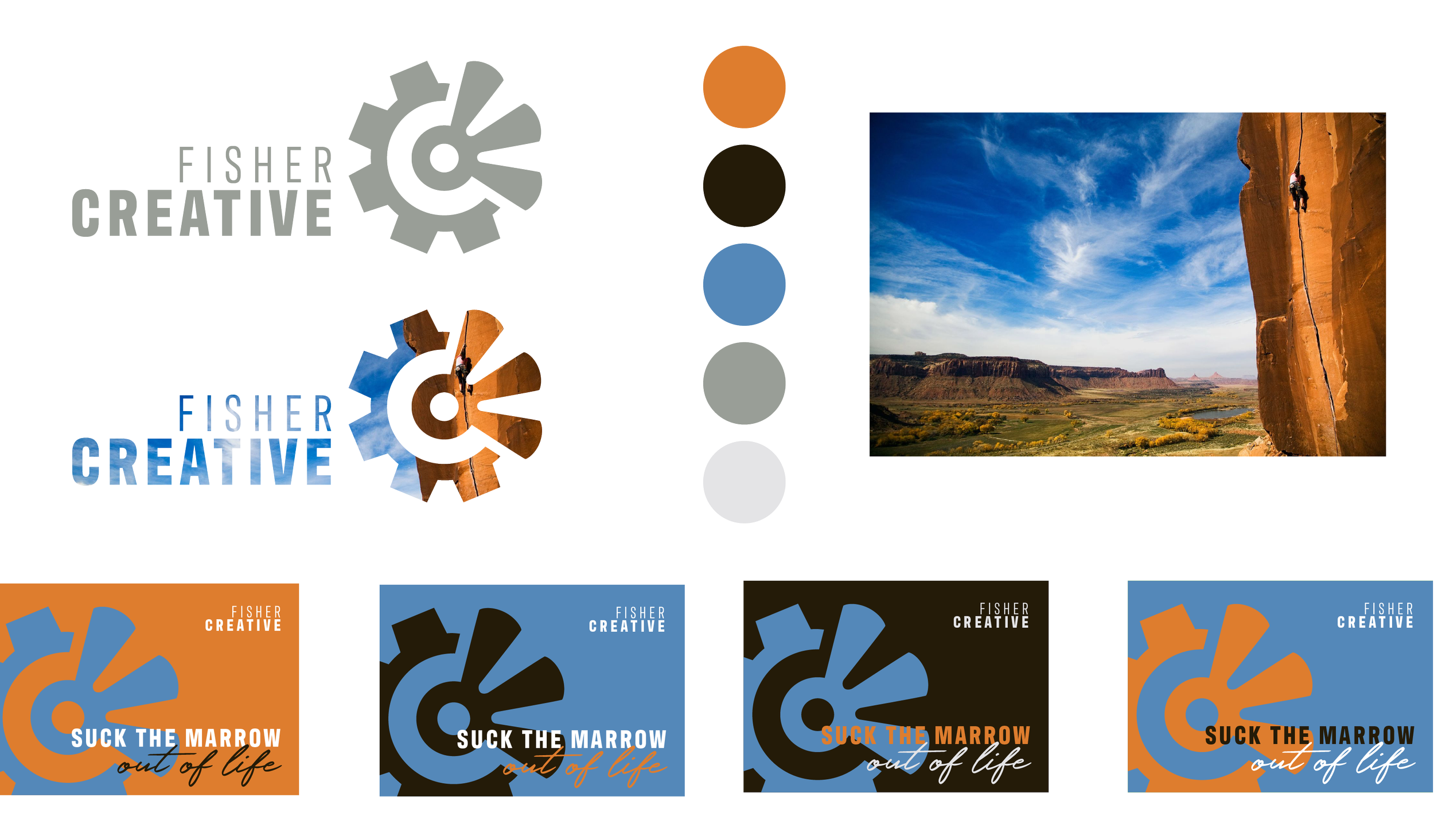
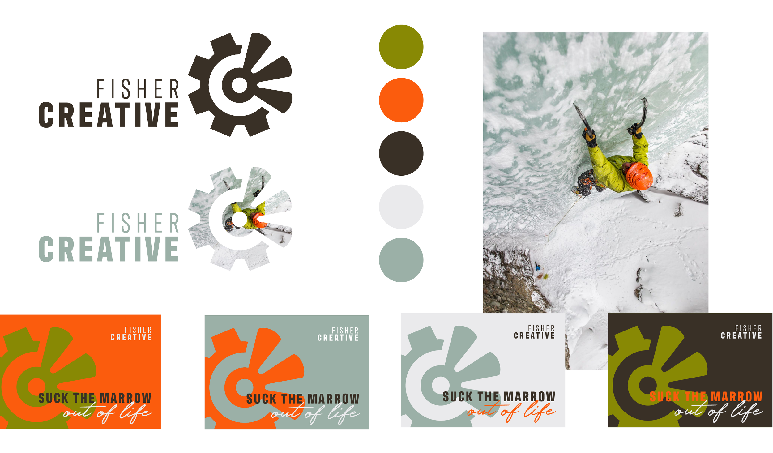
Fisher already had bright, energetic colors in mind—#ADf100 (acid green) and #FF7919 (orange)—but hadn’t been able to use them effectively.
3
We explored several palette options inspired by Fisher's stunning visual content. The chosen palette was built around a photograph of the aurora borealis: bold and electric but grounded in deeper, supportive tones. Clear usage rules and examples were included to ensure the palette energizes without overwhelming.
-
![]()
Inspiration: Aurora Borealis
Client Favorite!
-
![]()
Inspiration: Ski Gear
-
![]()
Inspiration: Cliff and Sky
-
![]()
Inspiration: Ice Climber
Typography choices were guided by the brand’s adventurous, no-holds-barred character. Antarctican became the headline font across all collateral. As an accent, we introduced the handwritten font Holland—a fast-moving, dynamic contrast to the heavy sans serif. For body copy, the brand uses a serif or sans serif depending on context, with flexibility built into the brand guide.

4
Brand Assets
To bring the new system to life, we created a suite of key brand assets.
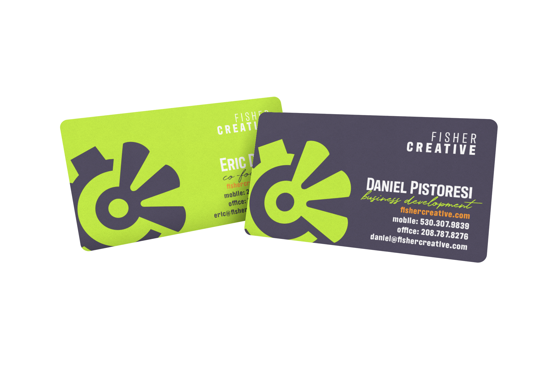
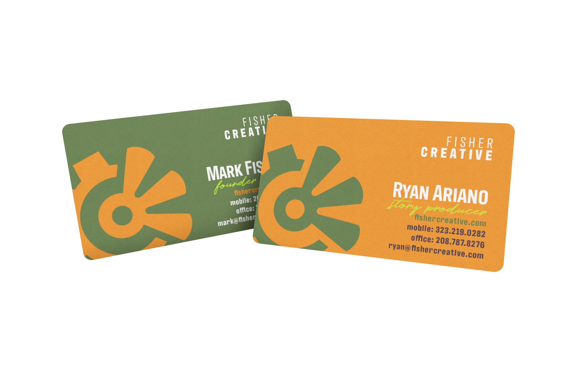
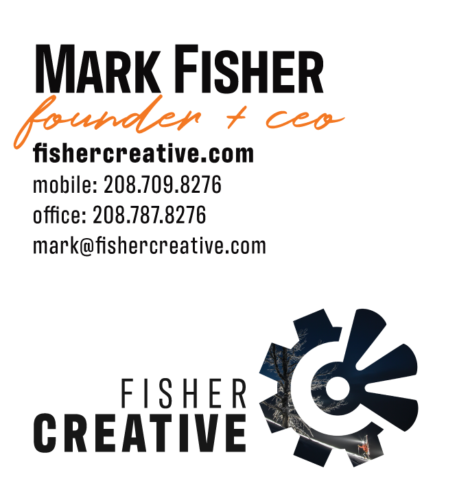
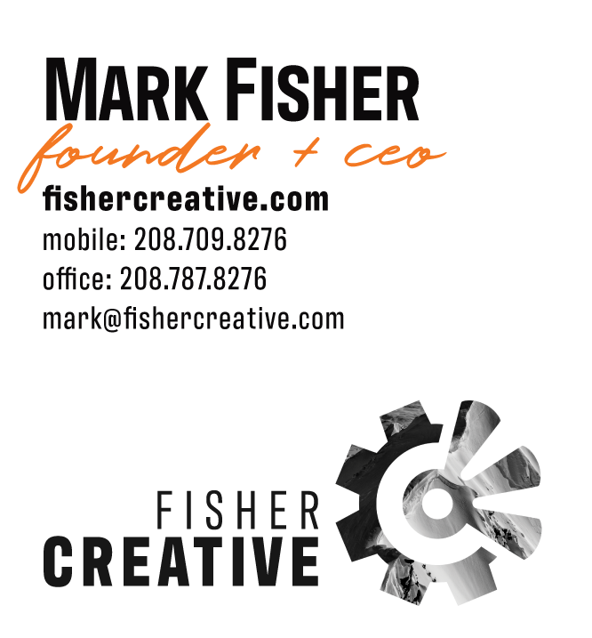
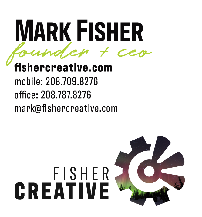
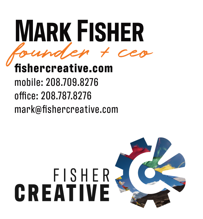
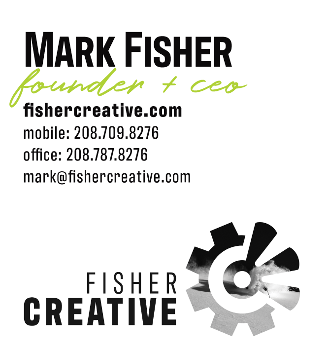
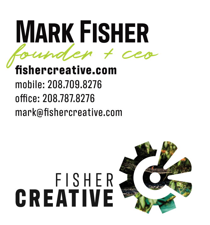
Business Cards
Bold, photographic, and double-sided for maximum impact. Cards are designed using all the color combinations of the branding. Using Infinity Print by moo.com, each team member gets a variety of designs in their set.
5
Email Signatures
Clean and readable with room for logo and contact details. Designed to be both mobile and desktop friendly. A variety of designs allows team members to choose their favorite while keeping things on brand.
Project Summary
This was a perfect example of building a structured, expressive identity around an already strong creative foundation.
By refining layout and typography, establishing a dynamic but functional color palette, and extending the system into brand touchpoints, we helped Fisher Creative create a consistent, compelling identity worthy of the world-class work they produce.
What Next?
We built a powerful brand playbook and Squarespace website using Fisher’s updated branding.

Have a visual identity that needs direction?
Let’s build a brand that moves with confidence.