

Portfolio: Case Study
Fisher Creative
Bold branding, a printed playbook, and a high-impact website for one of the most adventurous creative studios on the planet.

Client Overview
Fisher Creative is a premier media production studio working with top-tier adventure brands like National Geographic, Red Bull, and Patagonia. Their stories are captured from the most remote and iconic locations on Earth. They approached us for three things: a structured visual brand system, a printed brand playbook, and a powerful new website with an integrated eCommerce store.
The Challenge
Visual Branding
Fisher Creative had a memorable logo and a few color choices, but no structured brand system to back it up.
Without typography rules, hierarchy, or application guidelines, their visual identity was inconsistent and difficult to scale. This inconsistency made it harder to deliver a seamless brand experience to clients and collaborators.
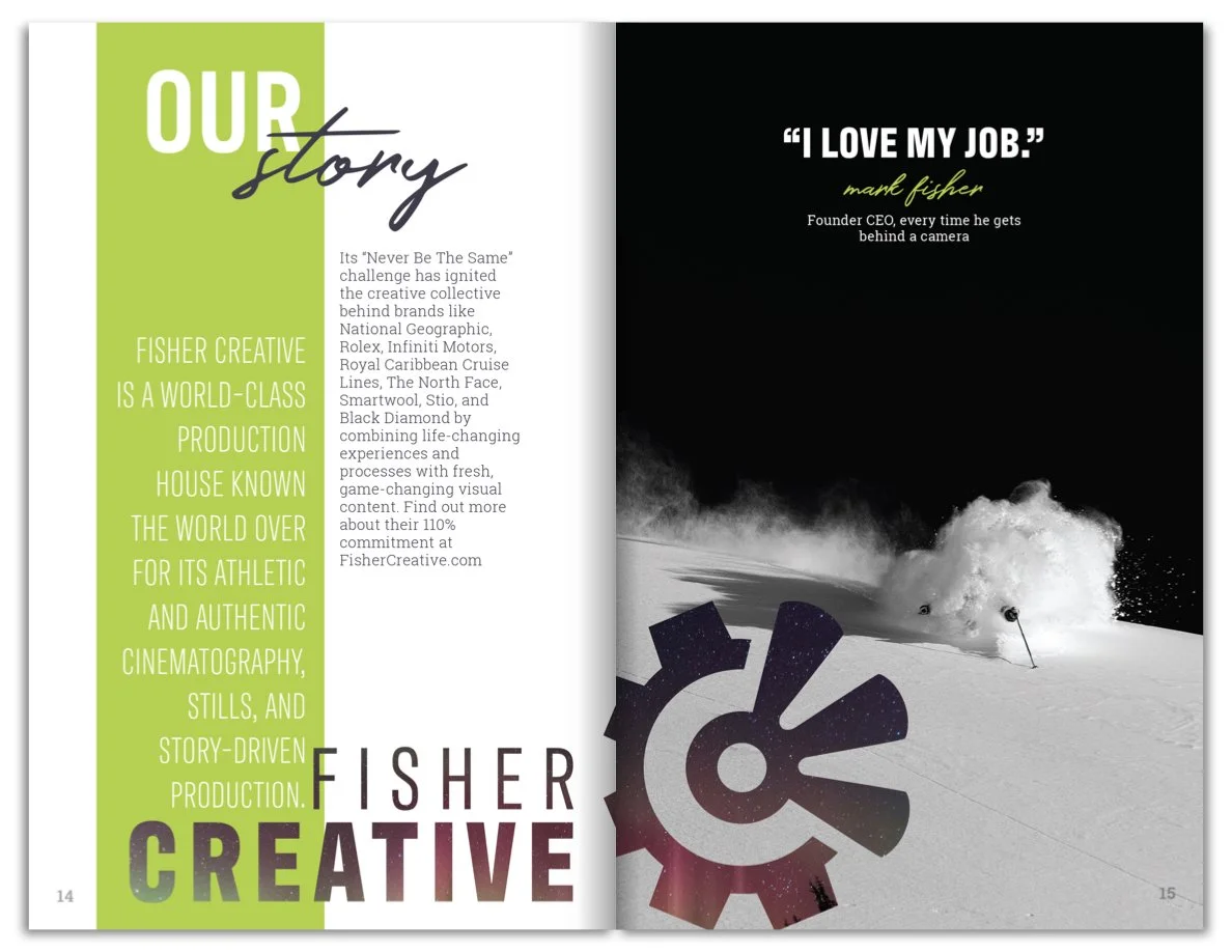
Brand Playbook
Fisher Creative needed more than a brand guide—they wanted a physical artifact that could define their culture, voice, and values. Something that could bring their team together and articulate their brand to high-level clients.
But they didn’t have a structure or precedent for how to distill such a multi-dimensional brand.
Website
Their existing site didn’t reflect the premium quality of their work. The design lacked impact, the structure didn’t support a portfolio of their scale, and they didn’t have a way to sell prints or apparel.
They needed a solution that was visually bold, mobile-optimized, and easy for their team to update.

The Solution
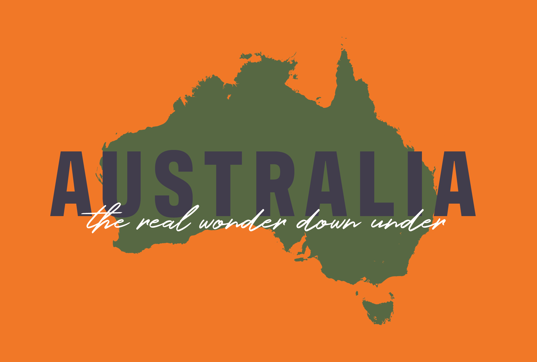
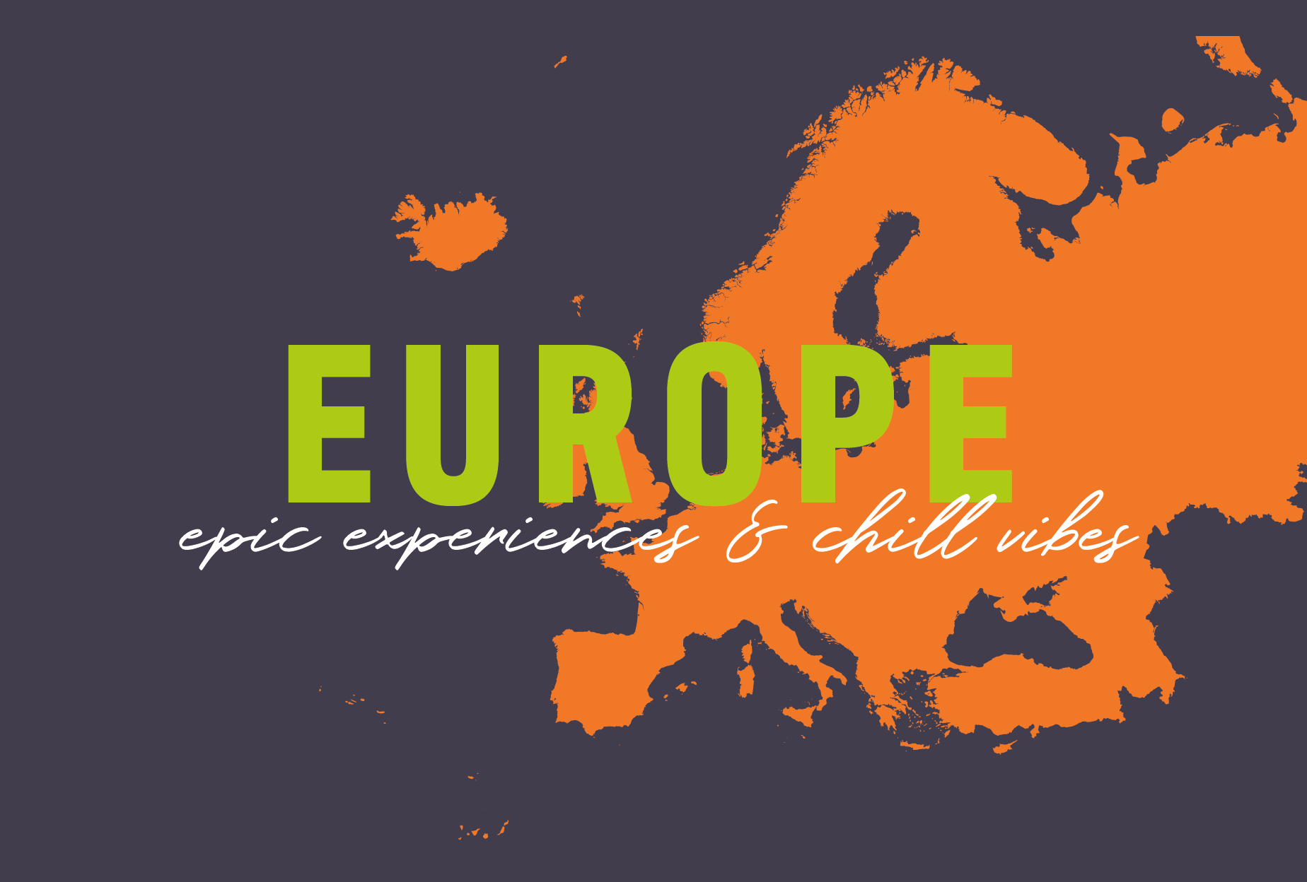
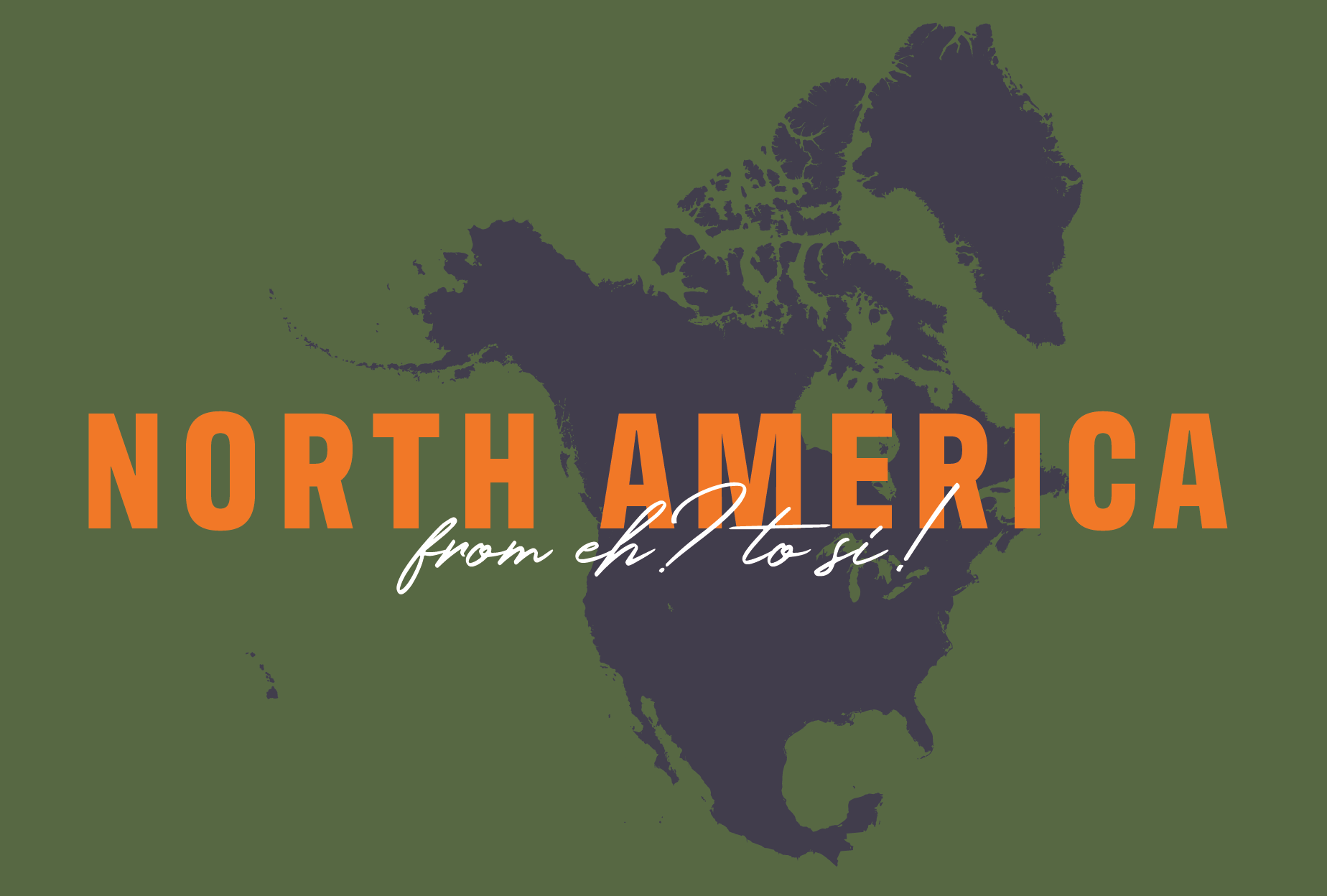
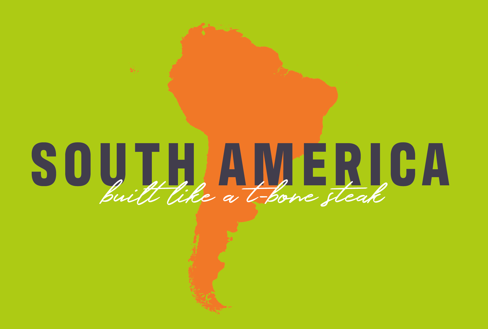
high energy branding
We developed a confident and energetic visual identity with all the components needed for consistency:
Hierarchical color palette of orange, lime green, army green, and deep purple
All-caps sans serif headline font with handwritten accent font
Application guidelines for consistent use across all channels
Business cards and email signatures for the team
This system captured Fisher Creative's bold personality and made their visual presence as compelling as their storytelling.

Original logo before branding project

Updated logo after brand refinement
how the sausage gets made
Think this is bold? You should see the first concepts we came up with! See the process behind Fisher Creative’s bold visual branding here >
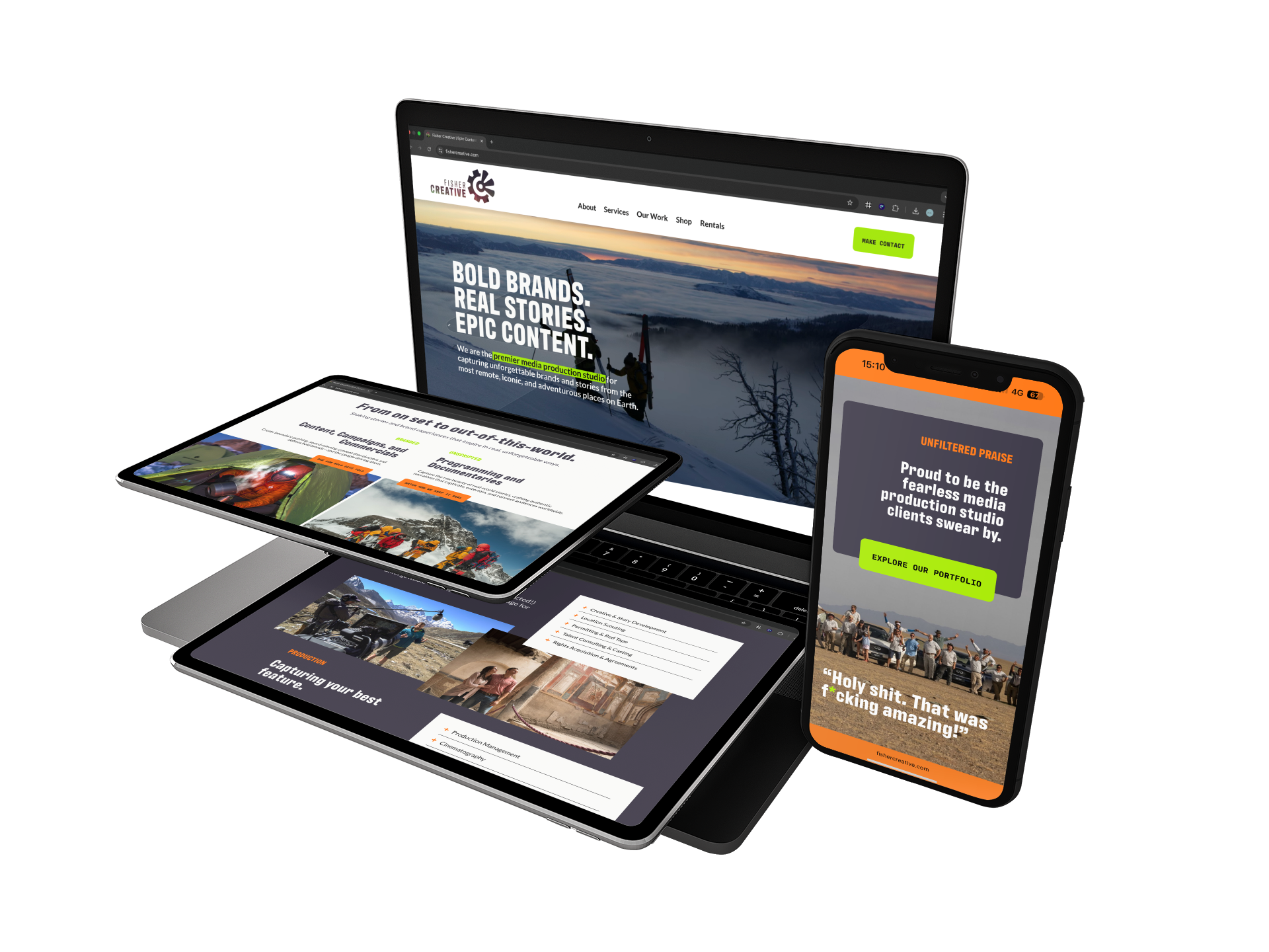
vibrant new website
We built a new Squarespace site inspired by their updated branding and playbook:
Clean, bold design with intuitive navigation
Smart copy by The Hungry Typewriter, full of voice and clarity
eCommerce store with 100+ products (prints + apparel)
Mobile-first design, robust portfolio integration
Custom blog and SEO optimization
The site is now a proper home for their stunning work—and a tool to support both sales and storytelling.
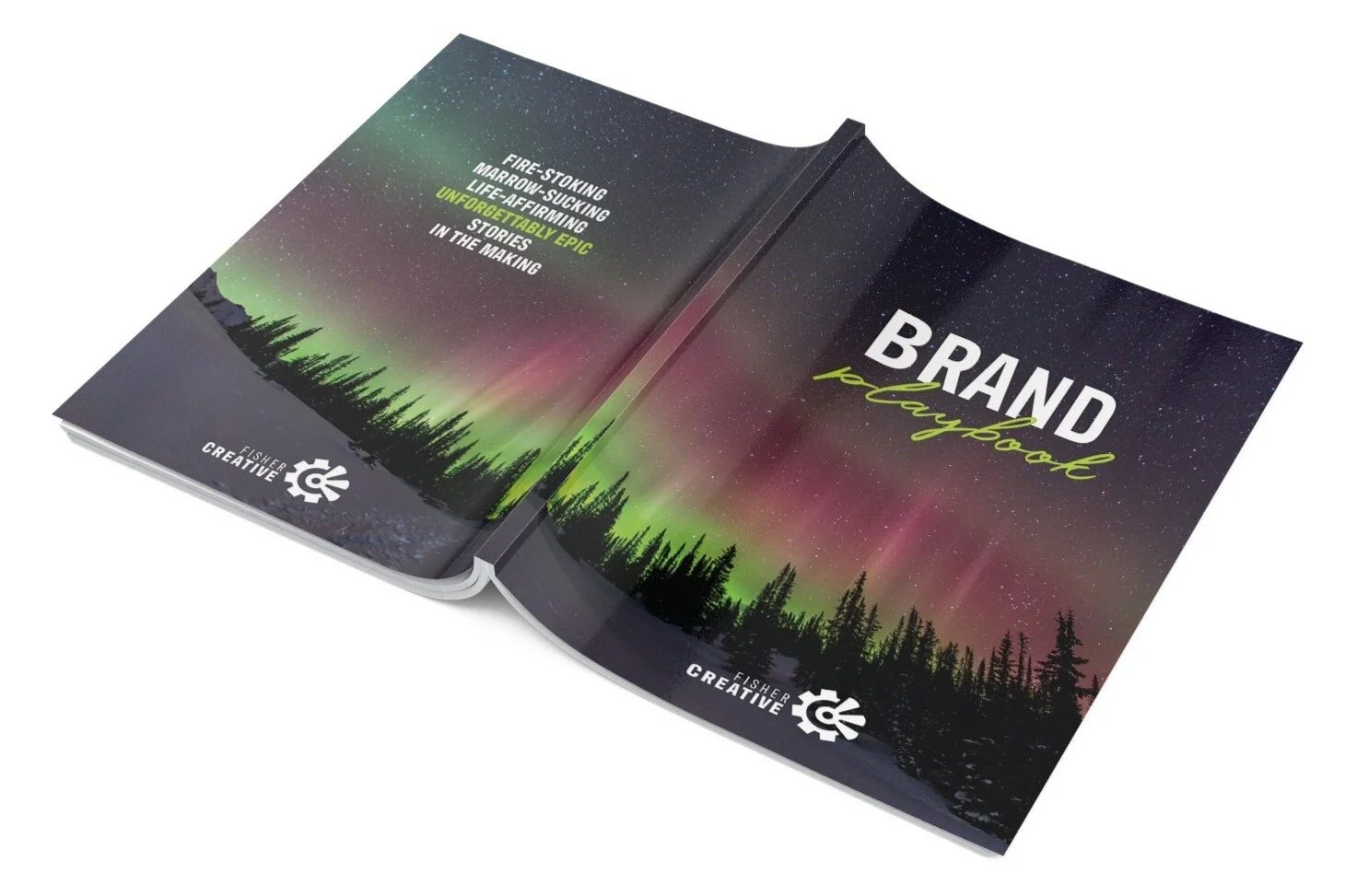
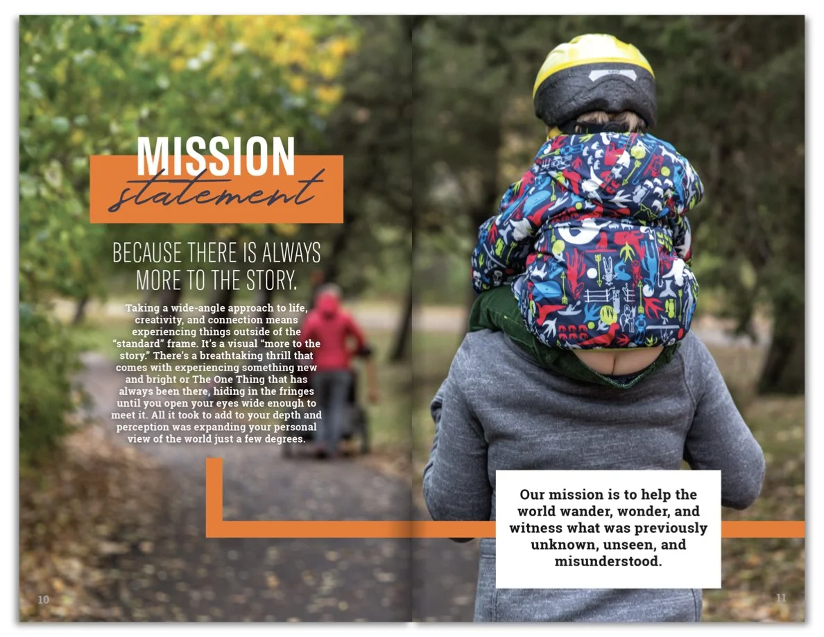
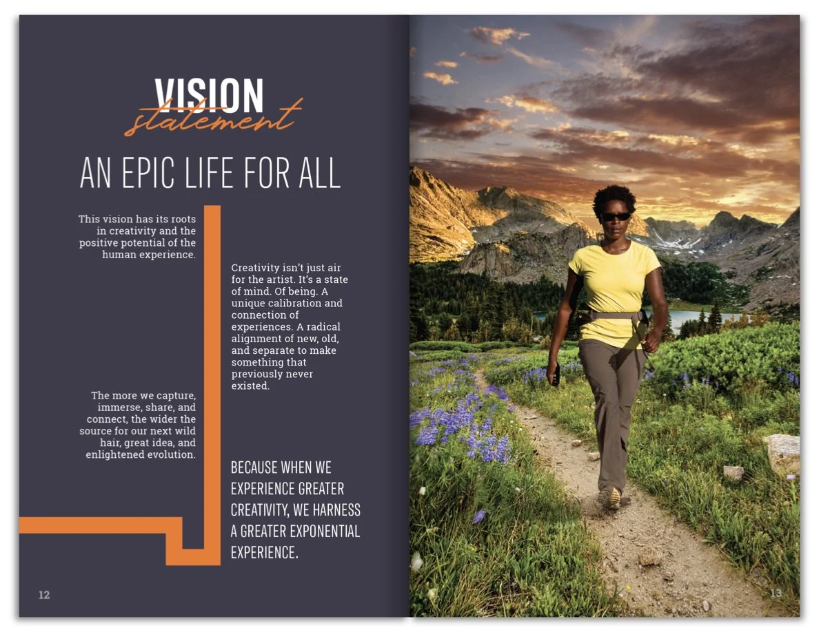
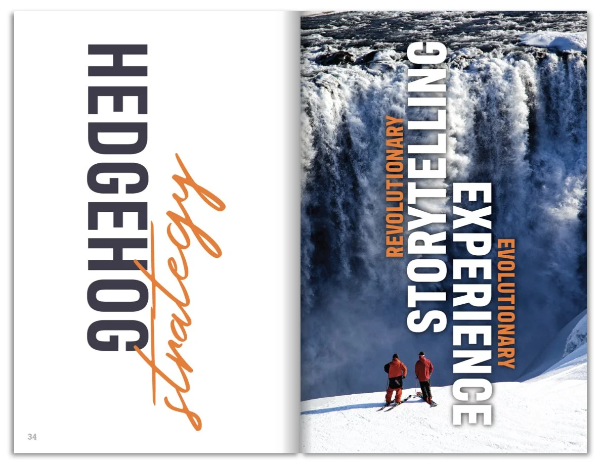
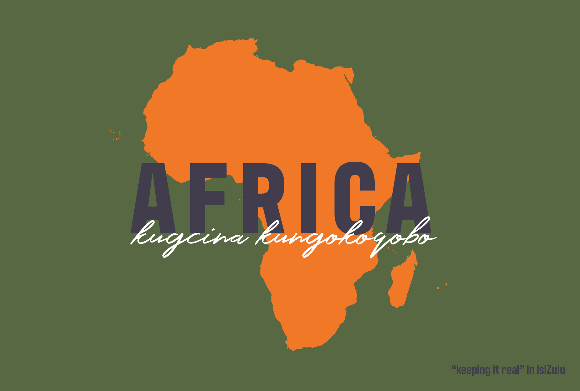
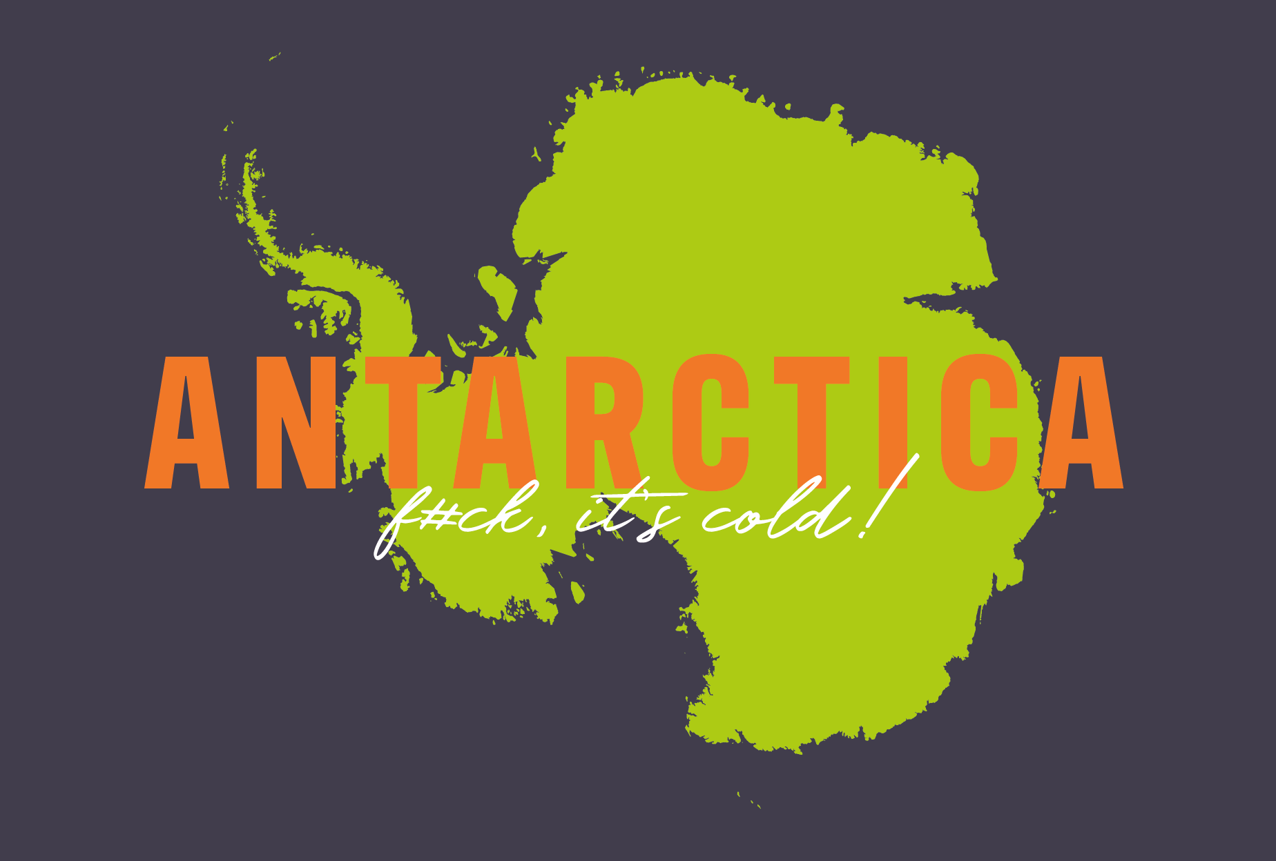
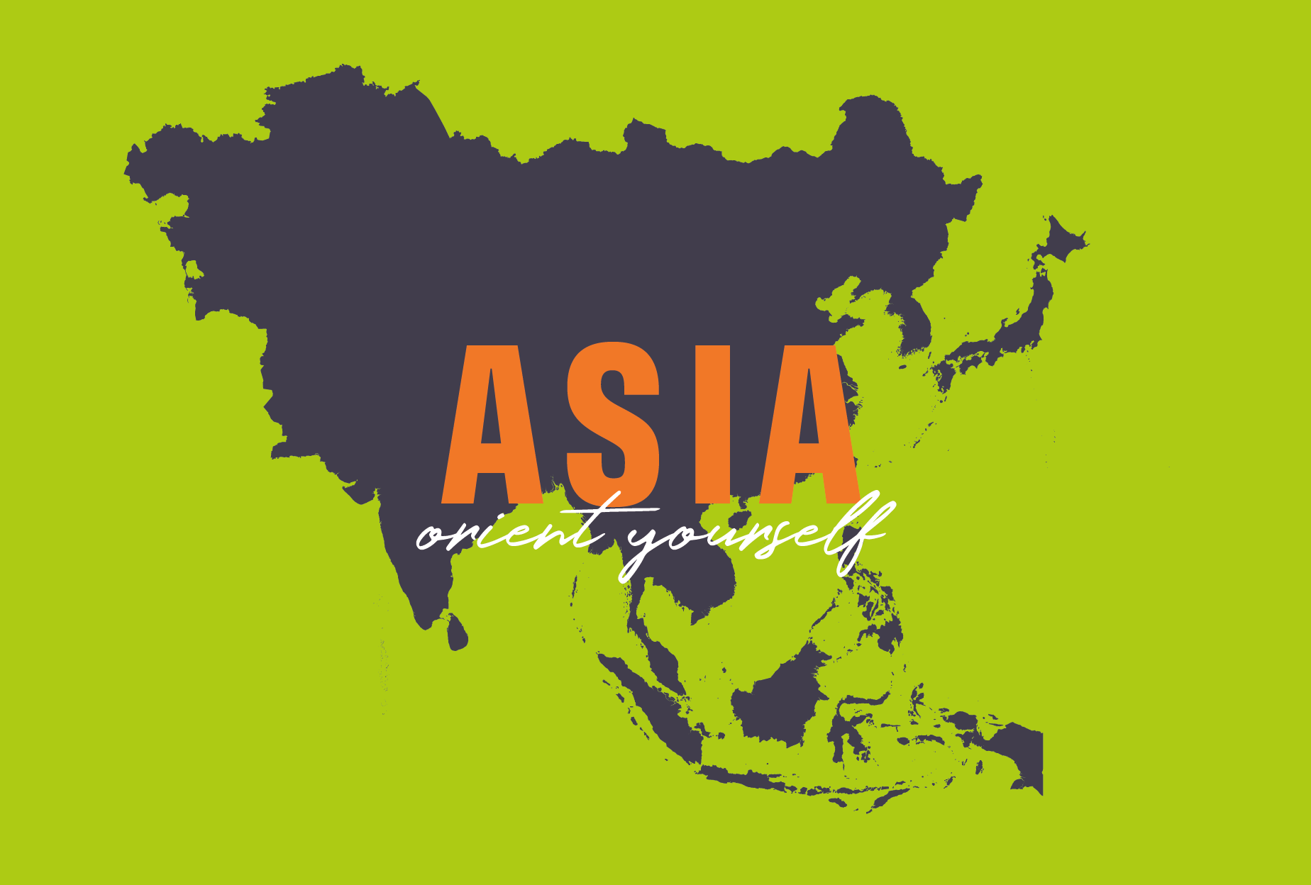
powerful Brand playbook
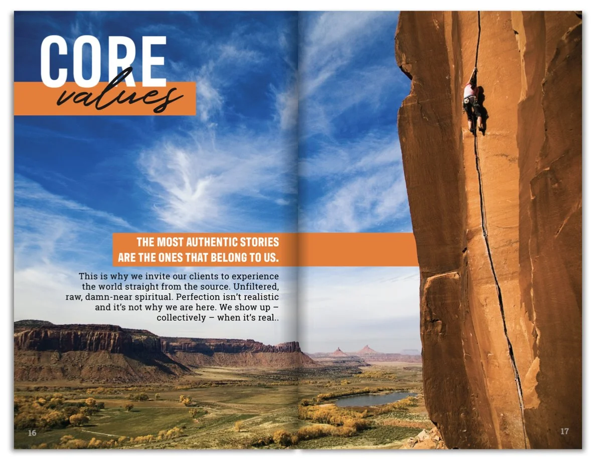
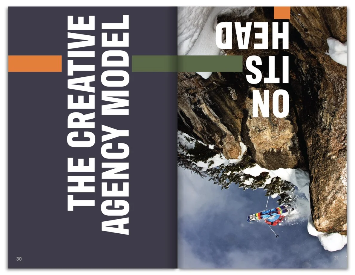
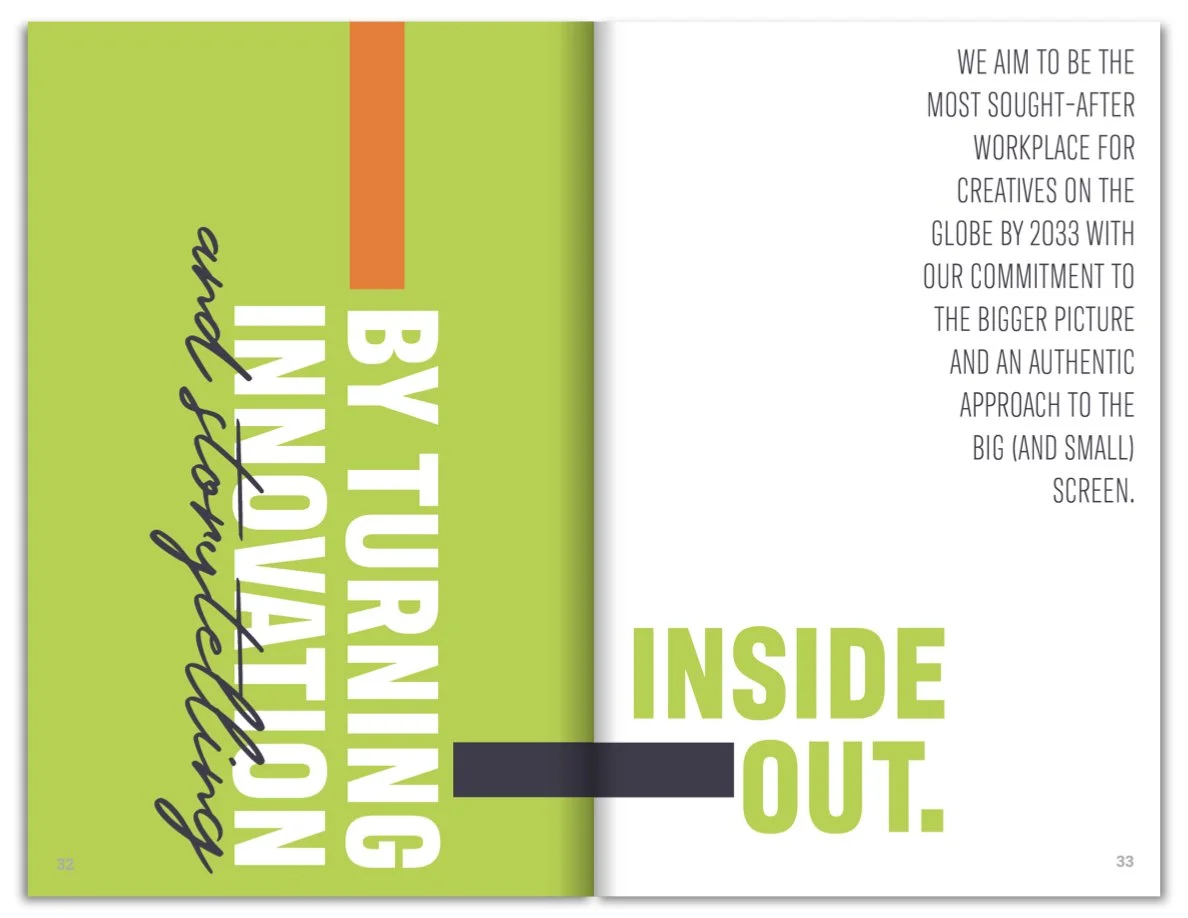
A printed, premium booklet capturing the soul of a business. Designed to guide internal teams, onboarding, creative decisions, and marketing conversations. Each one is entirely unique—a custom tool for clarity and alignment.
Fisher Creative's playbook included:
Brand story, mission, vision, values, beliefs
Voice & tone, lexicon, communication principles
Visual brand examples and guidelines
Printed, A5, 60–80 pages, designed for daily use

Brand Playbook Process
Fisher Creative’s brand playbook became more than an internal tool. They now use it as part of their client proposal process, helping them land premium accounts with aligned values.
Content Development
Kacey from The Hungry Typewriter led discovery sessions and a deep editorial process with Fisher's team.
Design
We designed the book for real-world engagement—bold layouts, scannable headlines, space for notes.
Production
Printed via Smartpress on durable paper with a matte finish, shipped directly to the client.
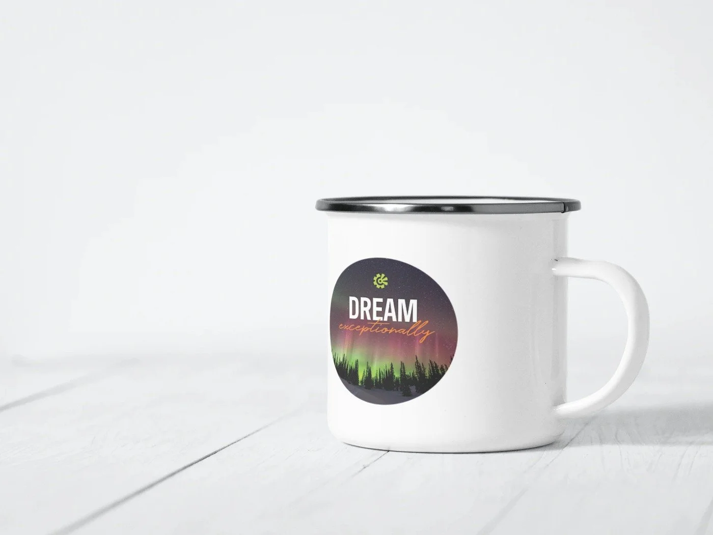
Brand Assets
To extend the new brand across touchpoints, we designed:
Apparel swing tags
Studio door signage
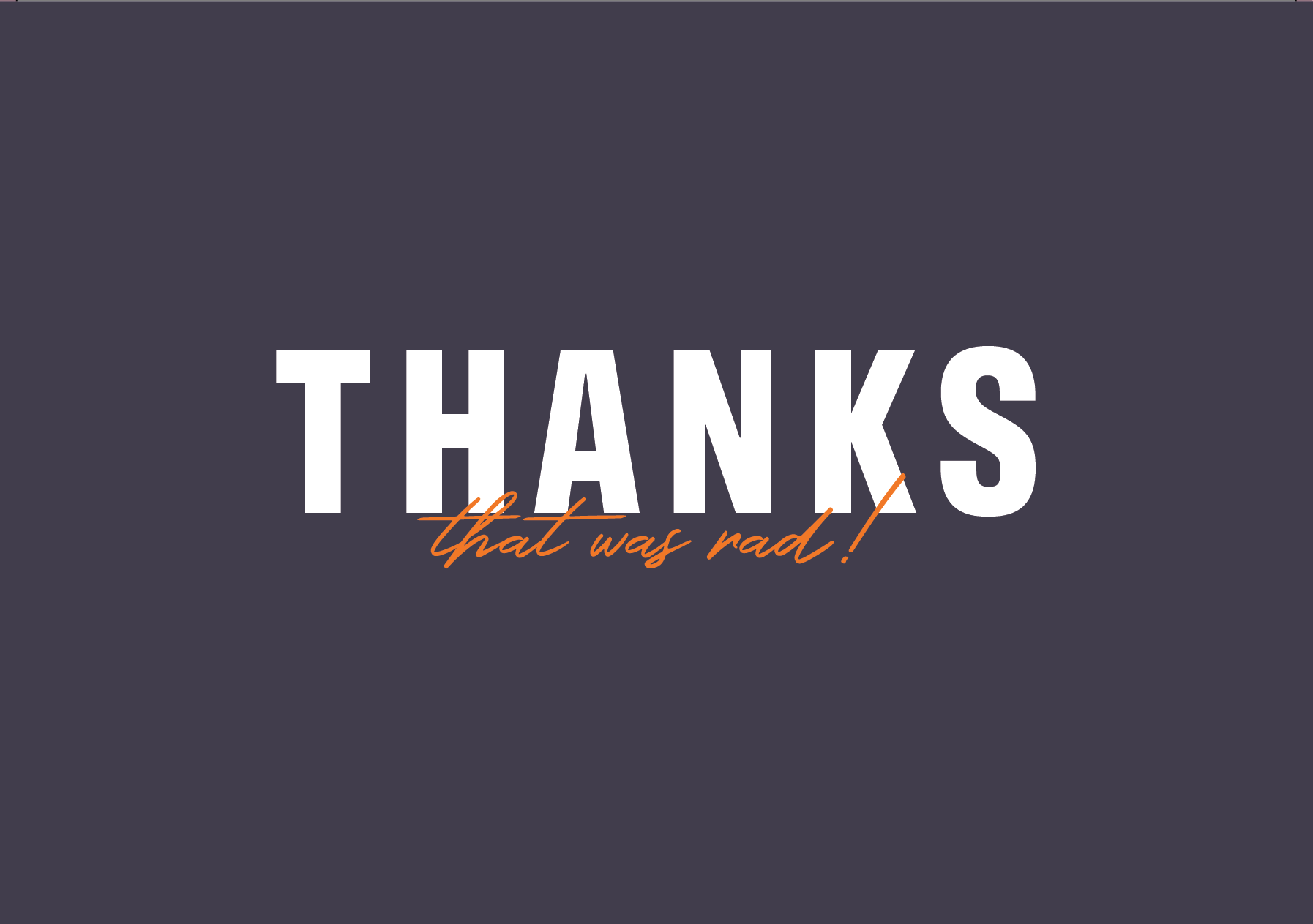
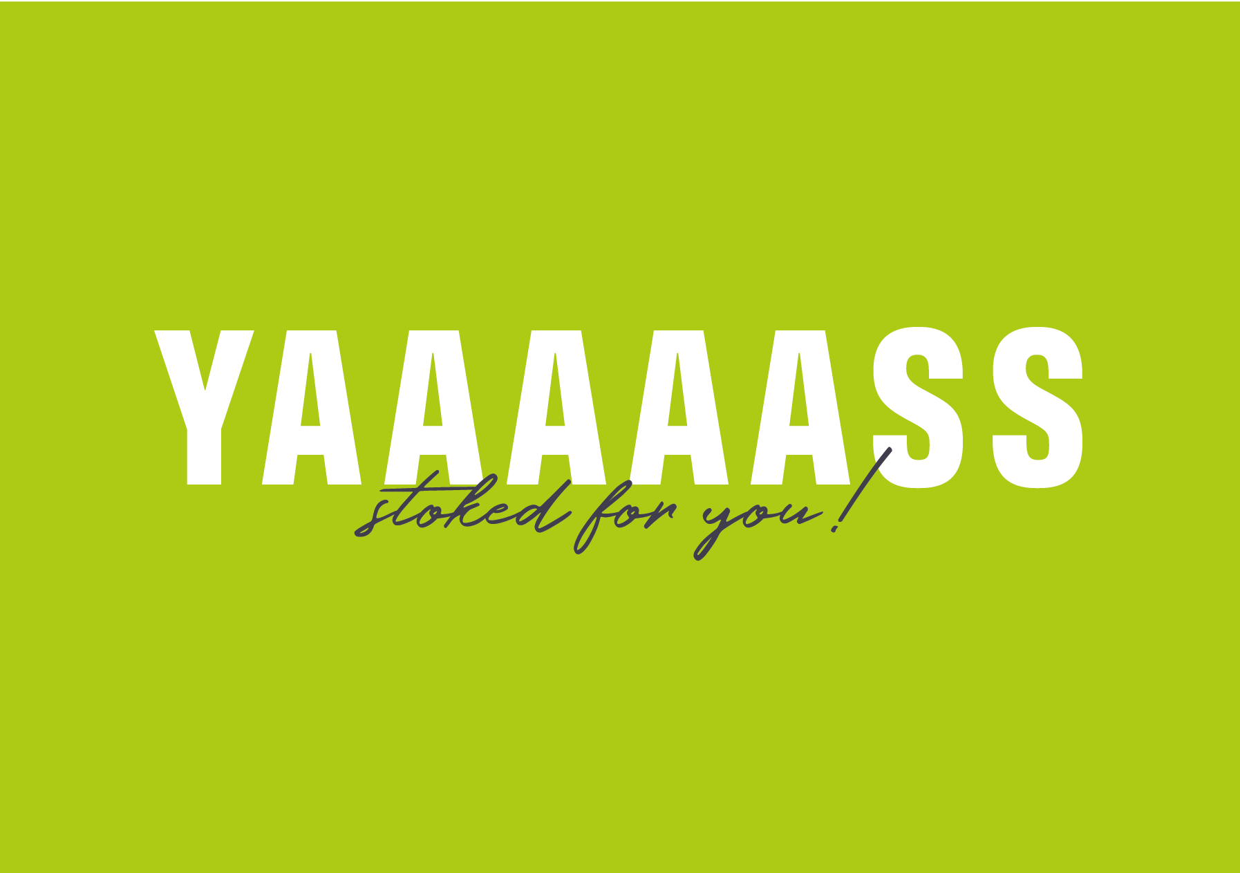
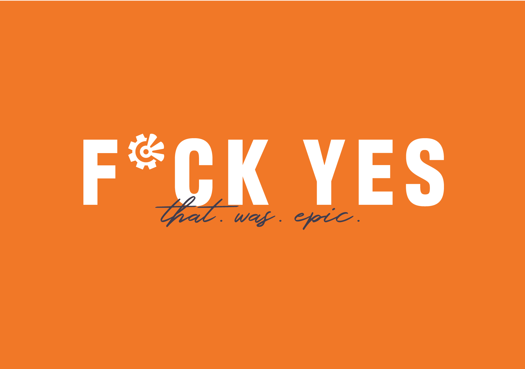
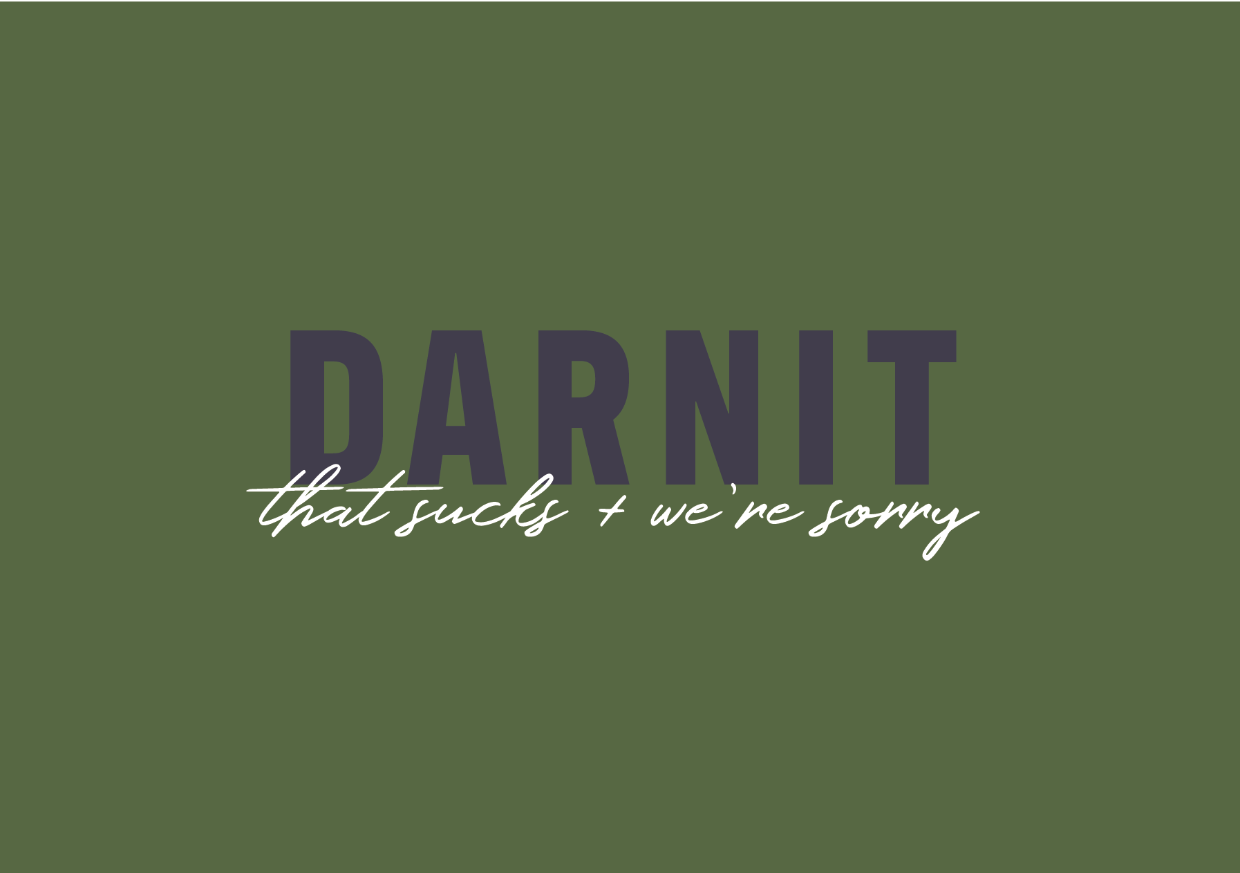
Greeting and postcard sets that could be sent from anywhere for any occasion
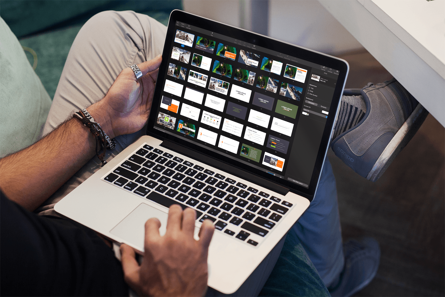
Branded presentation slides
Mailchimp email templates
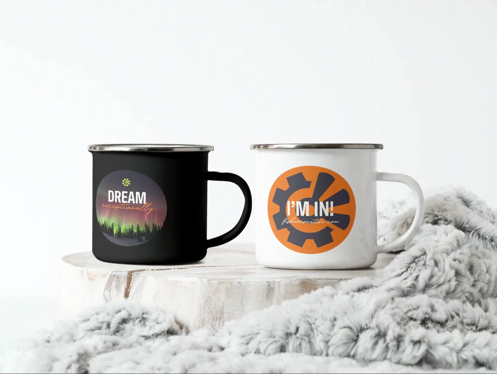
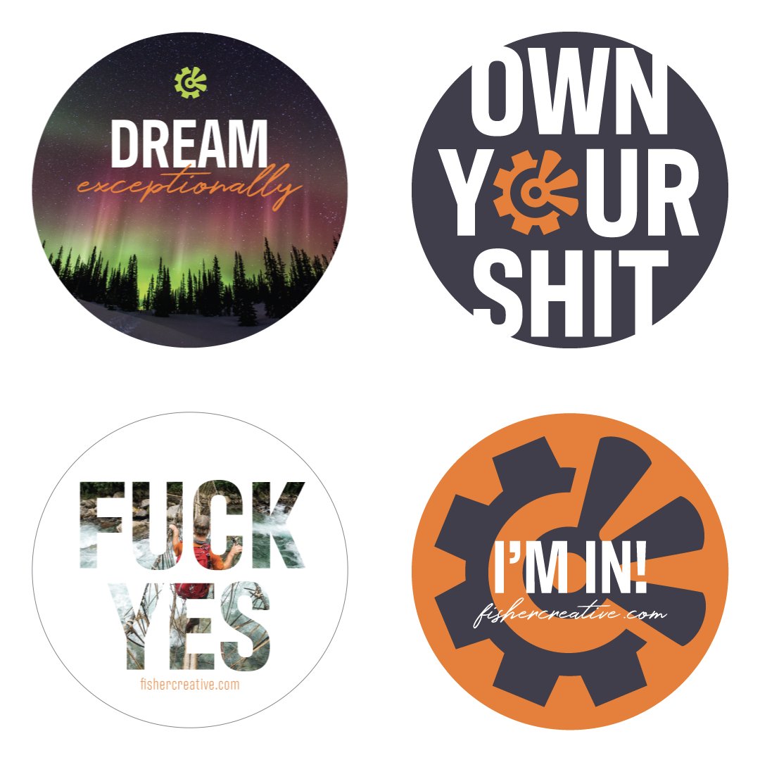
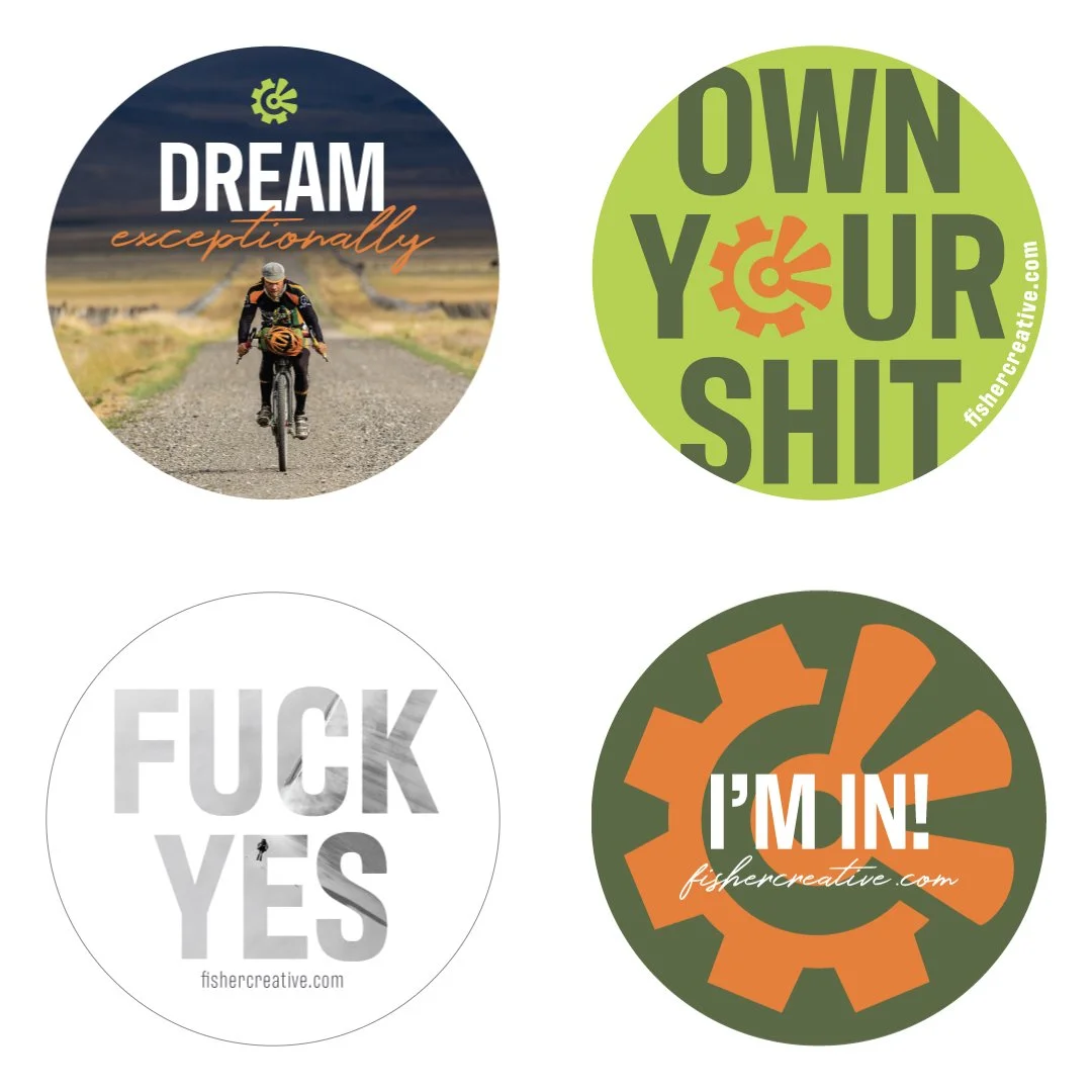
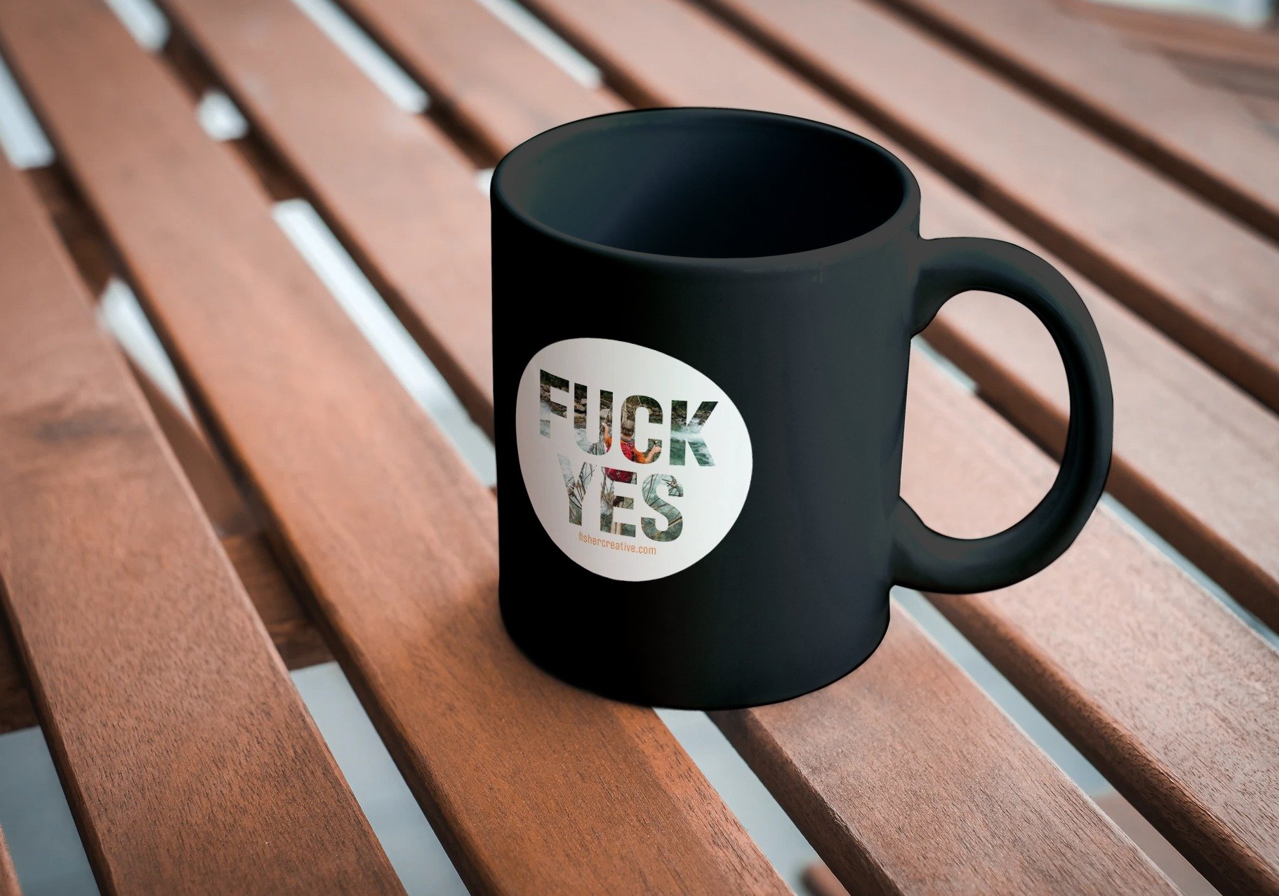
Custom stickers
Their stickers have now seen more passport stamps than we have ;)

Ready to moooove
I always recommend moo.com for printing. They worked with Fisher to ensure the printed color on the postcards and greeting cards were as bold and bright as intended.
Project Outcome
With an elevated brand identity, a story-driven playbook, and a powerful website, Fisher Creative now has a suite of tools to match their extraordinary talent.
Their updated branding doesn't just look good—it works hard for them, building trust, landing clients, and inspiring everyone who comes into contact with it.
Client Feedback
“I am thrilled with the playbook! I’ve just started using it as a digital marketing tool, and the first thing my future client said to me on the call was, ‘Your playbook is so incredibly amazing. I read the entire thing and I was so inspired. I knew instantly we had to work with you and that your company was the perfect fit for us!’ I am grateful to you for truly helping me elevate the brand.”
—Mark Fisher, Founder CEO


Want Results Like These?
Tools Used